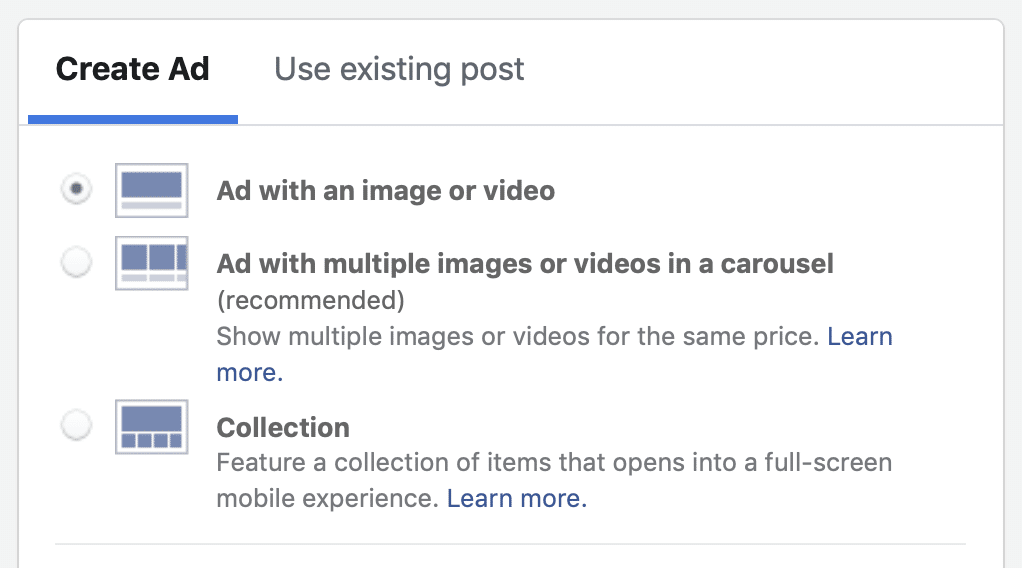
When you create an ad on Facebook, do you choose a single image, carousel, or another ad format? A single image is the easiest and fastest to create, but Facebook recommends using the carousel format.
So, does it actually deliver better results? Or should you ignore Facebook’s recommendation and keep things simple and use the single image format?
Hypothesis
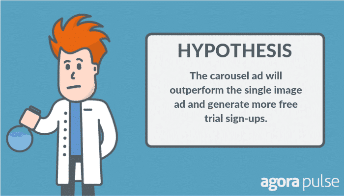
Let’s dive into our experiment. Here’s our hypothesis: The carousel ad will outperform the single image ad and generate more free trial sign-ups.
Are we right or wrong? Let’s find out.
Purpose of the Experiment
The main goal of the experiment was to drive free trial sign-ups from visitors to our website who did not register for a free trial.
So, the core metric for success in this experiment was the number of free trial sign-ups triggered by the complete registration event, recorded by the Facebook pixel on our website.
Additionally, we set a secondary metric triggered by the Purchase event of new customers. We wanted to see how many people converted from their free trial to a paid monthly subscription and assess whether the results were consistent with the free trial results, one step further up our sales funnel.
If one of the ad formats can deliver significantly more free trial sign-ups at a lower cost, we can set that ad format as the starting ad type for future website remarketing campaigns.
Let’s now take a look at how we set up the experiment.
Setting Up the Social Media Lab Experiment
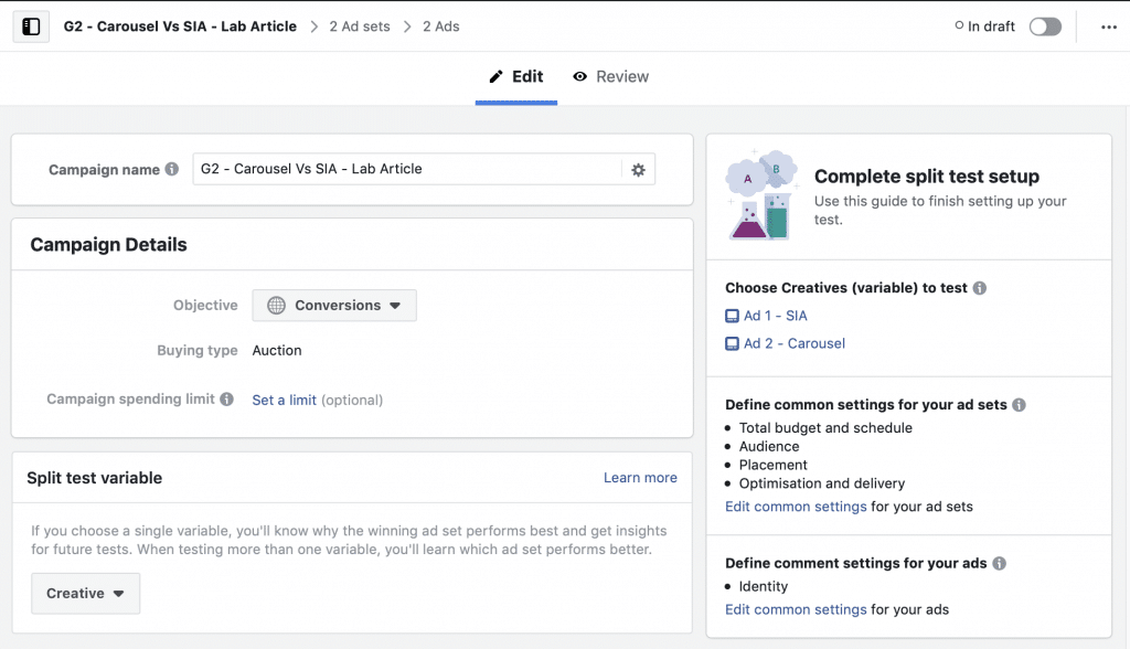
As we were testing two ad formats against each other, targeting a single audience, we created only one campaign.
We used the Conversions objective, as we know the end action we want our audience to take but optimized for link clicks to reach more of our target website custom audiences.
If we had optimized for Conversions with this type of campaign, given the smaller audience size compared to cold audiences such as Lookalikes, Facebook would have narrowed our audience too much. Doing so would have resulted in a higher cost per acquisition (CPA).
We also used the Split Test feature to ensure fair ad distribution amongst our target audience.
If we had created a campaign without using the Split Test feature and just had two ads in a single Ad Set, after the first 500 impressions Facebook would start delivering more reach to the “best” performing ad. We wouldn’t have had a fair test.
To easily find and understand the Campaign, Ad Sets and Ads within our Ads Manager dashboard, we used a standard naming best practice. Doing so saves you so much time when scrolling through data, especially if you run a lot of campaigns.
Next, with both Ad Sets selected, we edited them to create two identical Ad sets that would divide our audience into non-overlapping groups, so we got a fair test.
Each group was then shown the ad in that Ad Set, with one being the single image format and the other the carousel format.
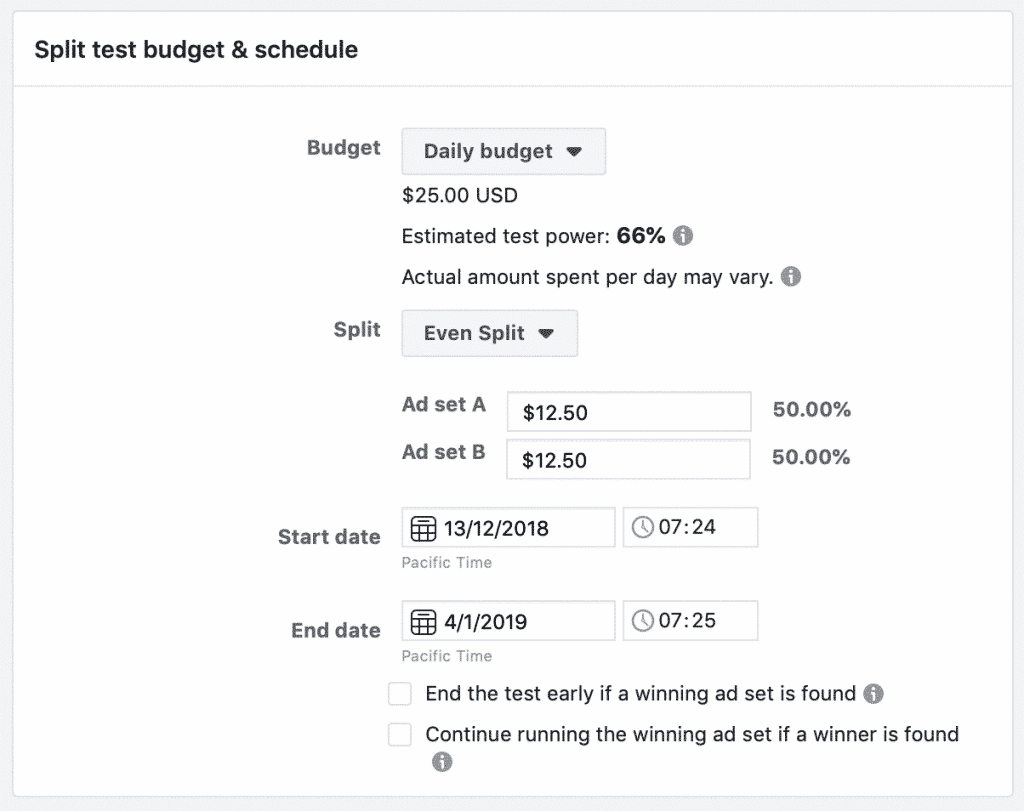
Budget: We set a $25 per day, even split budget across the two ad sets and duration of just over 3 weeks to get enough test results.
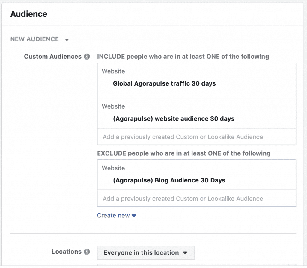
Audience: We targeted all website visitors in the last 30 days and excluded any existing customers or free trial users by adding an app exclusion of the Agorapulse manager app.
We went with Worldwide targeting to create the largest possible audience size with open age and gender demographics but narrowed the audience somewhat to English speakers only.
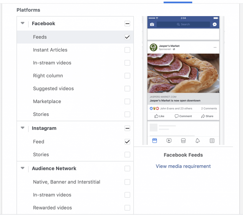
Placement: We targeted Facebook feeds both mobile and desktop as well as the Instagram feed. These are the most engaging placements, which we’ve found to deliver the highest-quality results.
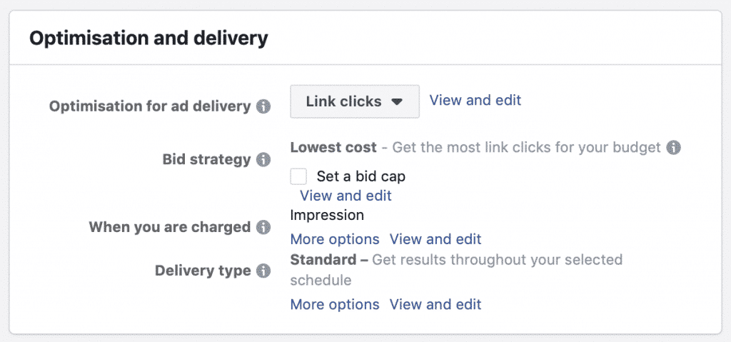
Optimization & Delivery: We changed the optimization from conversions to link clicks as we were already targeting the hottest audience type and didn’t want to narrow our audience any further by optimizing for conversions. We set Lowest cost bidding without a cap, we were charged for impressions, and we had standard ad delivery.
Facebook Ads in Our Experiment
Finally, let’s look at the ads. In this experiment, we wanted to test the effectiveness of carousel ads against single image ads.
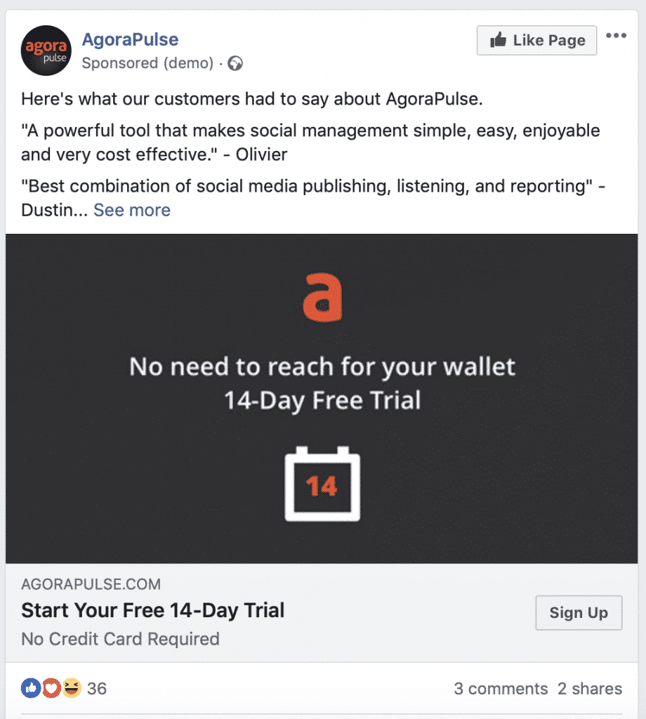
With both ads, we wanted to keep some ad variables the same to try and isolate the effect of the creative format. So, we kept the copy the same in both and set the same image for the single image ad and the first image of the carousel ad.
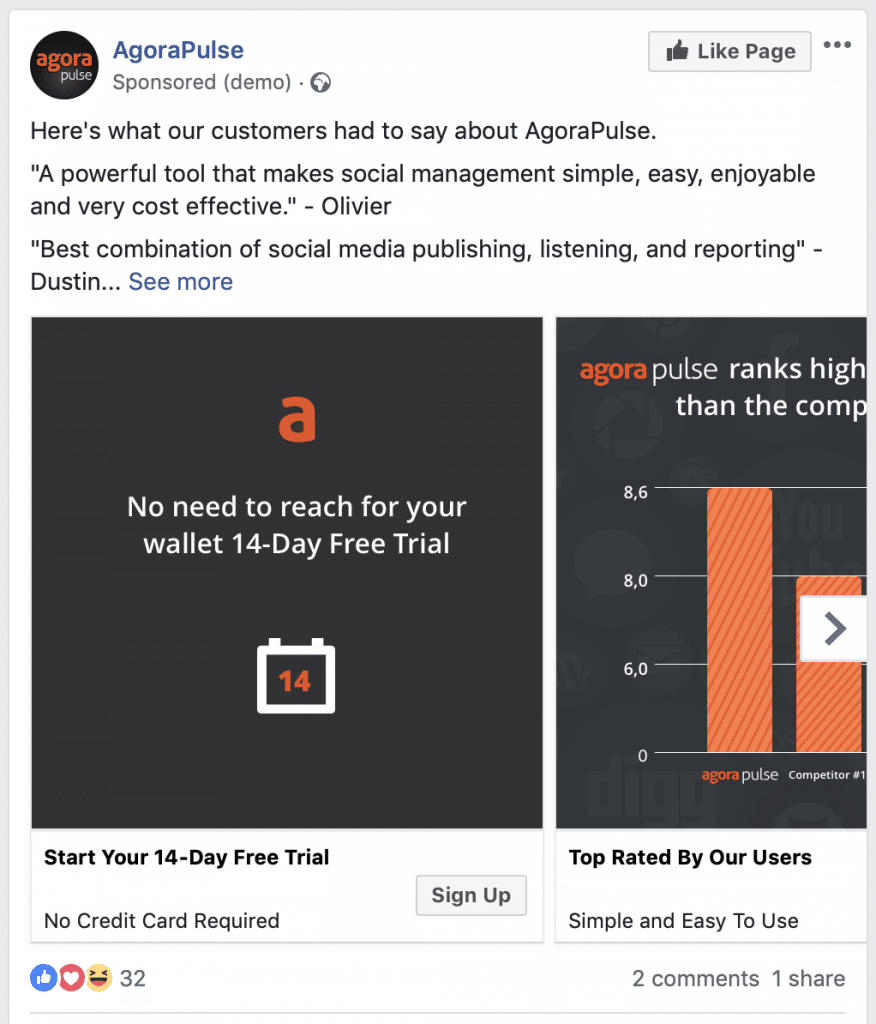
At this bottom stage of the sales funnel, testimonial-based ads are extremely effective. We knew that, so we started the copy with a number of customer testimonials and then stated the offer (the free trial) as well as a call to action.
Here’s what the single image ad looked like:
Here’s the carousel ad:
Results of the Social Media Lab Experiment
*Dive further into the study and results on our Social Media Lab LIVE episode:
Let’s look at the overall results.
We spent $549.98, which generated 101 free trial sign-ups at a cost per sign-up of $5.44.
The campaign also resulted in 400 link clicks and 9 purchases from people who converted to a paid account, generating a total of $1,323.25 of revenue, a 2.4X ROAS.
Next, let’s look at a breakdown of how each of the ad formats performed.
Carousel Ad Format:
Free Trial Sign-ups: 51
Cost per Sign-up: $5.39
Reach: 8052
Amount Spent: $274.99
Link Clicks: 190
CPC: $1.45
CTR: 0.29%
Purchases: 4
Purchase Conversion Value: $765.49
ROAS: 2.78X
Single Image Ad Format:
Free Trial Sign-ups: 50
Cost per Sign-up: $5.49
Reach: 7918
Amount Spent: $274.99
Link Clicks: 210
CPC: $1.30
CTR: 0.35%
Purchases: 5
Purchase conversion value: $557.75
ROAS: 2.02X
Hypothesis: Right or Wrong?
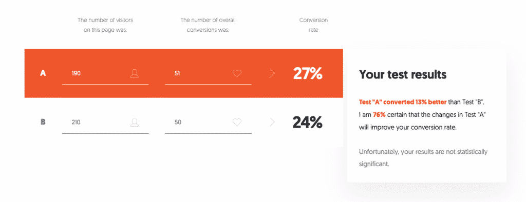
As you can see from the data above, the carousel ad did perform better than the single image ad by having a higher conversion rate, which resulted in one additional sign-up. However, the findings are not statistically significant.
Our hypothesis was that the carousel ad would outperform the single image ad and generate more free trial sign-ups.
Although this occurred, we can’t be confident that the same result would happen if we were to run the test again.
So, we can’t conclusively say that the carousel ad format is more effective at generating sign-ups and will outperform the single image ad format.
We had thought the carousel would significantly outperform the single image, as they are better able to grab users attention and stop the scroll, as well as lead to more engagement and dwell time, due to the ability to interact with each of the cards in the carousel.
When targeting our hottest audience, though, how we presented the ad didn’t make much difference. That could be in part due to the fact that they already have some recognition and consideration having previously visited our website.
If you like what you see so far, please don’t forget to subscribe to our podcast and share it with your colleagues!
Other Lessons Learned
The value of purchases was higher from the 4 carousel ad purchases, at $765.49 compared to only $557.75 generated from 5 single image ad format purchases.
However, again this finding isn’t statistically significant given the low number of purchases.
* * *
Our experiment showed that the carousel ad format performs slightly better than the single image ad format. However, as the results are not statistically significant we don’t have confidence that the results would be repeatable in another test.
It goes to show that when targeting your website traffic, there isn’t a clear winner between using the carousel or single image format.
