What is it that catches your eye when you see a Facebook ad in your news feed? I’m sure you answered the image. (Am I right?)
The images we use in our Facebook ads are make or break. A good one gets likes, comments, shares and click-throughs. A bad one gets scrolled past without a thought.
The Facebook ad size plays an important role in the success of your advertising. Image selection and something called “the 20% rule” are additional hurdles to overcome in creating a great ad on Facebook. In this post, I’ll address these issues and look at some tools you can use to create images that work.
Facebook Ad Dimensions
The correct Facebook ad image size will depend on the type of ad you are trying to create.
Three standard dimensions:
- Website click ad: If you are creating an ad that contains a link the ideal image size is 1200 x 627 pixels.
- Like ad: If you are promoting your page, use the same image size as your Facebook cover photo: 851 x 315 pixels.
- Event ad: Event ads also use the cover image from your event. The ideal size is 851 x 315 pixels.
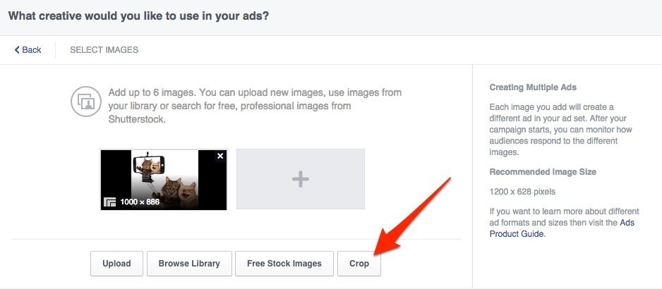
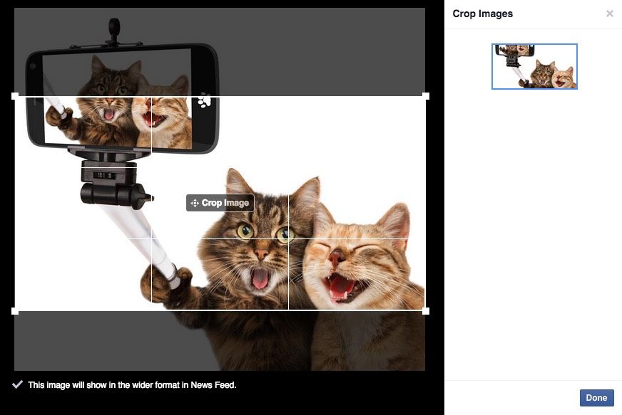
It’s not always necessary to resize images before you upload them to Facebook. If you have beautiful, high-quality images and are creating ads in Ads Manager or Power Editor, you can choose the area of the image you want to use with the ‘crop’ tool (see below).
Inspiration
Before you start creating images, take a look at other ads in your Facebook newsfeed. Which ones stand out? Which ones capture your attention? After a while you’ll start to understand the type of images that work.
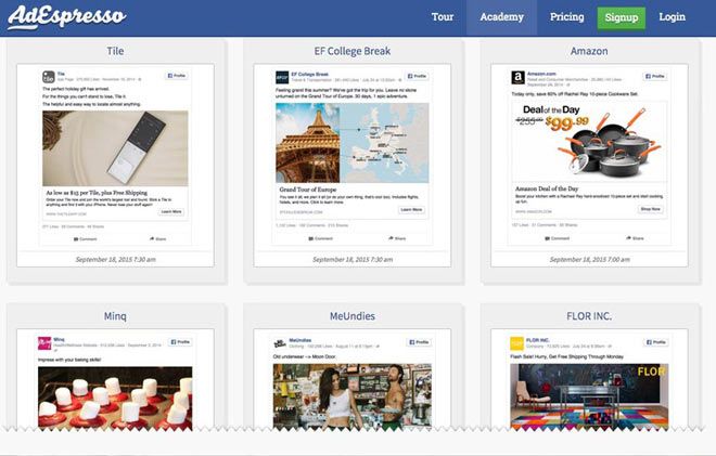
If you aren’t seeing enough ads in your newsfeed, AdEspresso have an excellent ads gallery to browse through. You can filter results to make them more relevant to the type of ads you want to create.
Creating Ad Images
If you are lucky enough to have a graphic designer at your disposal, you can send them the dimensions above. Don’t forget to tell them about the 20% text rule (more on this below) and they will create ad images for you.
For businesses on a lower budget, you will have to create your own. This isn’t as hard as it used to be. There are plenty of online and free tools you can use to make great visuals.
1. Canva
I’m beginning to wonder how I survived without Canva. It’s an amazing app that allows you to create great images for all your social media within minutes.
[Tweet “I’m beginning to wonder how I survived without @Canva.”]
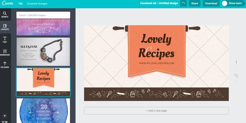
The nice thing about Canva is that you don’t need to remember all those ad sizes. You can start working with one of its pre-made sizing templates.
Here are the ones you will need:
- For Website click ads: ‘Facebook ad’
- For Like ads & Event ads: ‘Facebook cover’
When you choose a size, Canva offers you lots of pre-designed layouts to work with.
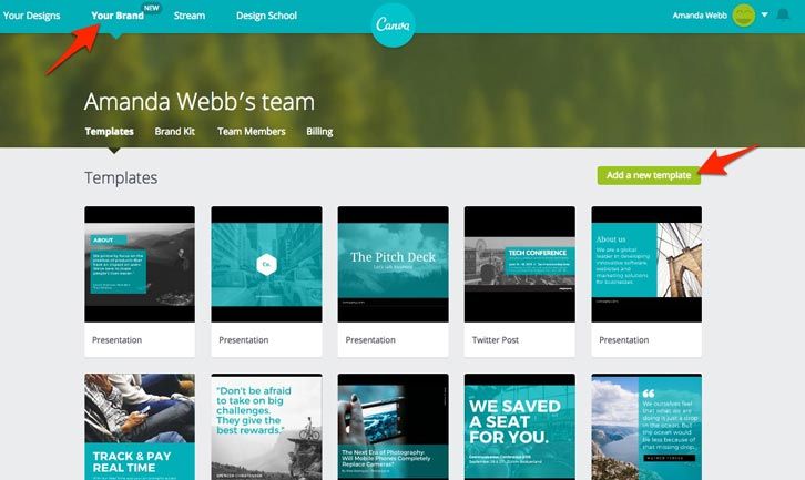
If you upgrade to the ‘Canva for Work’ offering, you can create and save brand templates for yourself. This helps you remain consistent and saves time.
Aside from the design functions, Canva also offers stock images for use in your creations for just $1 a pop. This is a massive savings compared to most stock photo sites.
The only downside is that so many people are using Canva some images can look very Canvaesque. You can combat this by designing your own specific style. Use your own images when you can and use a font and color scheme that complements your business.
2. PicMonkey
PicMonkey is an online tool that allows you to create and edit images. There is more flexibility with what you can do with this than Canva. It takes a little longer to create images here but it’s worth it for some of the effects you can create.
Unlike Canva, PicMonkey allows you to upload your own fonts and create multi-layered images. There are some nice editing tools included. (I love the one that removes your wrinkles — but don’t tell anyone.)
To create images the correct size for your Facebook ads, you have two options:
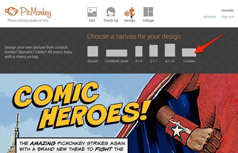
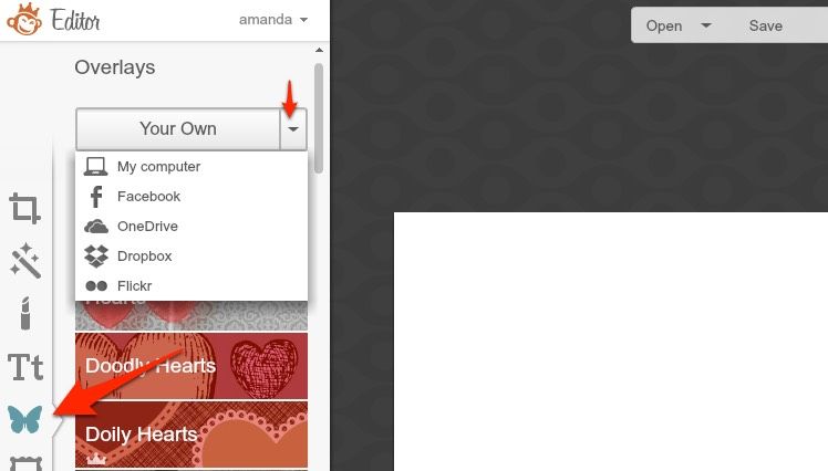
1. From the PicMonkey home page, hover your cursor over ‘Design’ and pick ‘Custom’ from the menu. Input your ad size dimensions here. Now you can add images from your computer as ‘overlays’. To do this click the Butterfly icon on the left-hand sidebar.
2. From the PicMonkey home page, click ‘Edit’ and upload an image from your computer. You can now resize or crop this image using the tools on the left-hand sidebar.
I follow the PicMonkey blog which always inspires me to try new design features.
3. Stock Photos From Facebook
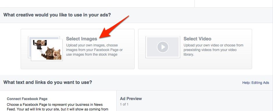
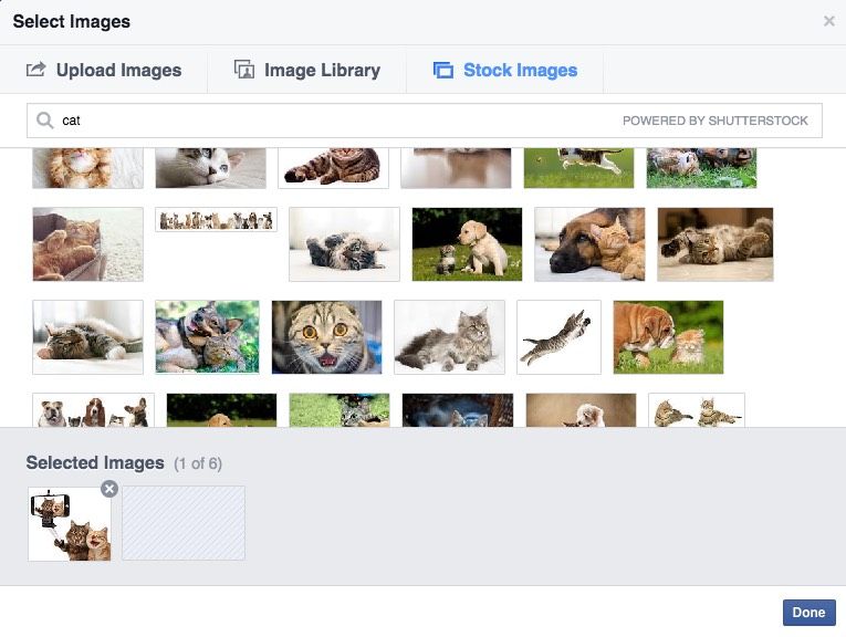
If creating your own images is too complicated, Facebook offers you free stock photos that you can use in your ads. You can access these via your Ads Manager and Power Editor.
In the creative section, click ‘select images’ and then ‘free stock images.’ Search a keyword or phrase for the type of image you want to find and select the ones you like from the results. Look for images that catch your eye as they should have the same effect on your audience.
Many of these stock images will not be the correct size for Facebook ads. You will need to crop and resize them within ads manager as I showed you earlier.
20% Text Rule
The most common reason that ads get rejected by Facebook is that the images used have more than 20% of the area overlayed with text. This includes the text in your logo.
What is frustrating about this rule is that it doesn’t really refer to 20% of the image. Instead, it uses a grid to define the text coverage. If your text fills more than five of the twenty-five boxes on the grid, it fails the test.
I use two tools to check my images before I use them in my ads.
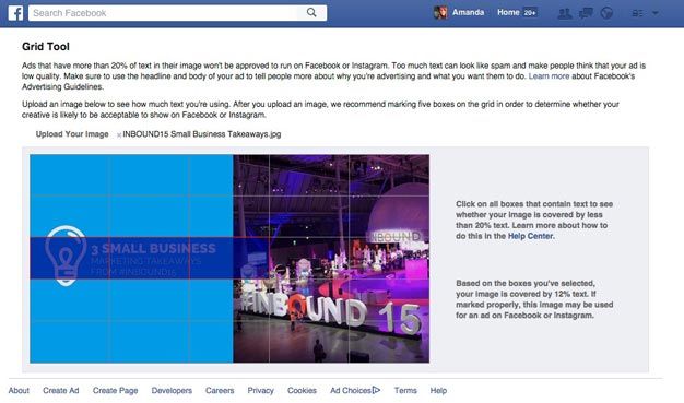
1. Facebook Grid Tool
This is Facebook’s own tool for judging the amount of text on an image. Once you have finished creating your photo, upload it and select the boxes that contain text. The tool will tell you if your image complies to the guideline.
If your image fails the test, you must go back to your image editing tool and guesstimate how much you need to shrink or move text around to fit. That’s where the second method comes in handy.
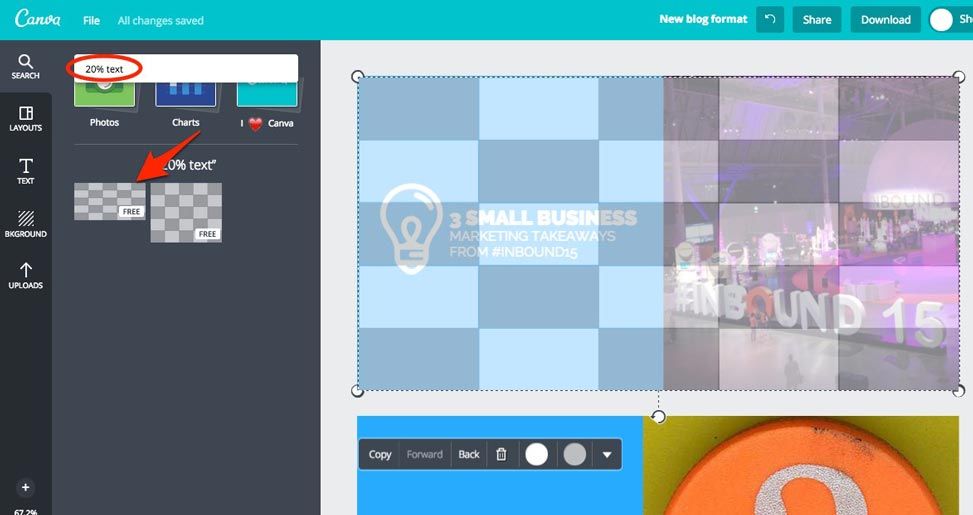
2. Canva
If you are designing in Canva, it is easy to check your images before you download them. Search for ‘20% text’ and click the grid to add it to your image. Just like the grid tool above you need to ensure that your text doesn’t fill more than five of the boxes.
The advantage of using this method is that as you are still in the design tool, you can shrink and move your text around until it fits. The disadvantage is that the grids that Canva offers only work for Image and website click posts. There is currently no option to check your cover image.
Split Testing
As a rule, you should never create just one image for your Facebook ad. When you upload multiple ads to a single ad set, Facebook will split test them and use the ones that get the best results for the rest of your campaign.
If you use Ads Manager, you can upload multiple images at the ad creation stage and Facebook will create an ad in the ad set for each. If you are using Power Editor, you can duplicate your ads within the ad set and change the image for each duplicate.
Summary
When creating images for your Facebook ads:
- Choose images that will catch your eye in the news feed.
- Make sure you are using the right image size for the ad type you are creating.
- Use editing tools to enhance your images.
- Make sure you comply with the 20% text rule.
- Use more than one image for each ad set.
Your Turn
Do you have any tips for creating great images for ads? Have you been caught out by the 20% text rule? Let us know in the comments section below.
