Like it or not, Facebook knows an awful lot about their users! This is good news for marketers and business owners. We can reach exactly the right people, the people who really want what we have to offer, with our ads. It’s like nothing else out there.
So why do so many businesses struggle with their Facebook ads? How can you make your Facebook ads better?
In this post I’m going to share 13 Facebook advertising tips for avoiding the most common Facebook ad mistakes and show examples of how you can overcome them.
1. Not customising your text
Facebook makes it very easy to create ads. You can set them up with just a few clicks from your Timeline. This convenience comes with problems, though.
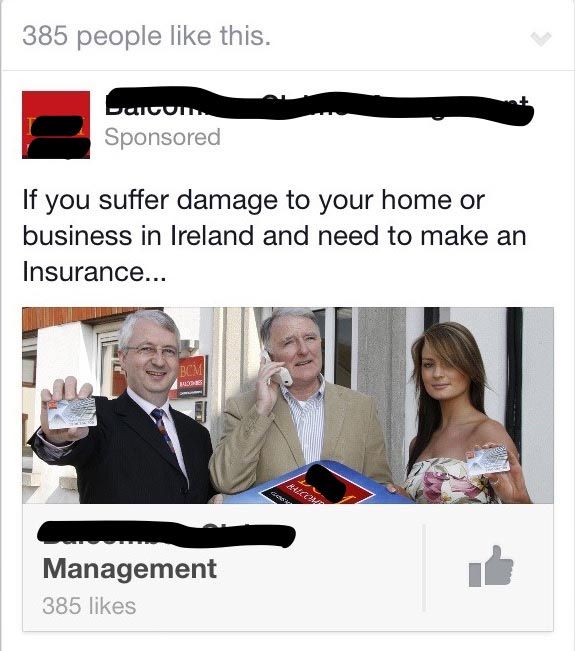
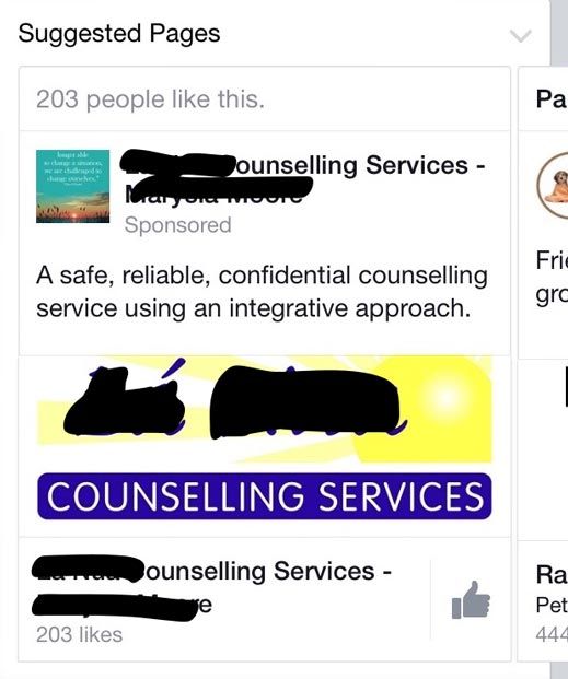
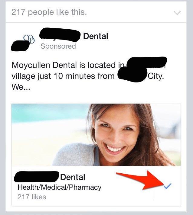
For example, when you set up a Page Like ad from your business Timeline, Facebook will construct the ad for you, taking information from your page and making an ad from it. In many cases, this will result in your text being truncated. See the example below.
How do you avoid this?
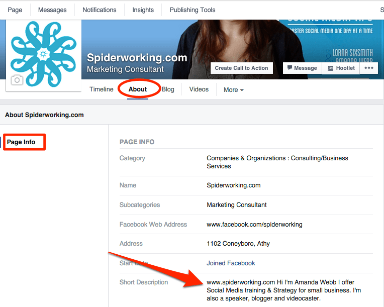
90 characters is the maximum amount of text that will display in your Like ad description. Facebook pulls this text from the ‘short description’ section of your page. To ensure your text appears in full you will need to edit your page description by clicking ‘About’ underneath your cover picture and then ‘Page info’.
This will fix your problem the next time you set up a Page Like ad from your Timeline. For even better results, I recommend setting up page likes ads from Ads manager. This gives you more options and control over the creative elements in your ads.
2. Talking about features rather than benefit
This is a classic marketing mistake and one we’ve probably all made at some stage. People on Facebook won’t be swayed to buy your product if you focus on features.
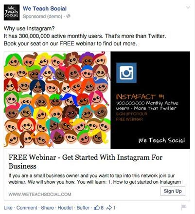
In this example for one of my companies We Teach Social we shared a series of Instagram tips to promote our Instagram for business webinar.
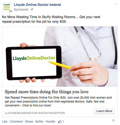
See how Lloyds Online Doctor addresses the frustrations many women may have with getting their monthly pill prescription.
3. Not getting specific with your targeting
Ad targeting is precisely what makes Facebook ads rock. There are so many ways you can narrow your audience to just the people who are interested in what you do.
You can target by:
-
- o
- Location
o
-
- Demographics
o
-
- Gender
o
-
- Marital Status
o
-
- Education
o
-
- Parental status
o
-
- Interests
o
- Behaviours and more
With all these targeting options it never ceases to amaze me that I see so many poorly targeted ads in my feed. When you see an ad that isn’t appropriate to you it’s not Facebook’s fault, it’s the fault of the advertiser.
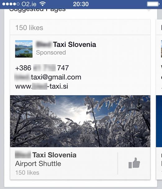
Here’s an ad I got in my feed advertising a taxi company in Slovenia. I live in Ireland and have no travel plans!
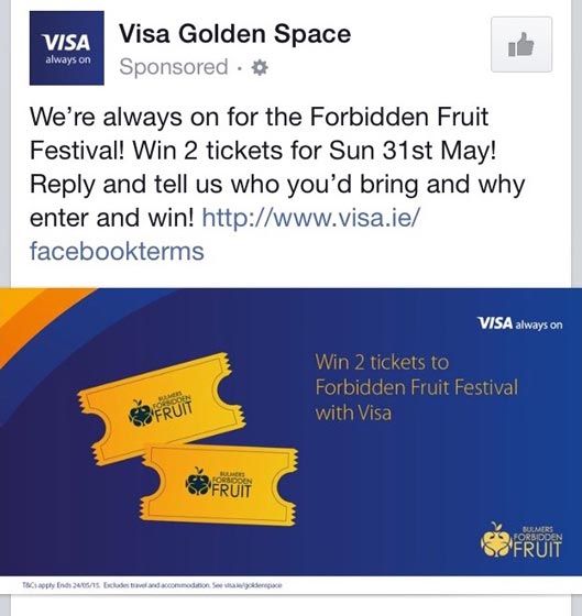
And here’s an ad that is hyper-targeted at me. I’m imagining that this ad is promoted to only those who have an interest in music events. To get it right they could have targeted people who like ‘The Electric Picnic’ ‘Body & Soul’ and other music festivals in Ireland.
4. Always pushing sales
People don’t like seeing ads in their feed. This is one of the reasons Facebook introduced their newsfeed algorithm tweak back in January limiting the organic reach of promotional posts.
By not distributing these posts organically they have full control of how many ads we see in our feeds. However, if we are constantly promoting our products and not paying attention to soft content we could end up losing our following. When people liked our page they expected to see a mixture of soft, useful and promotional content. We need to do the same when we advertise.
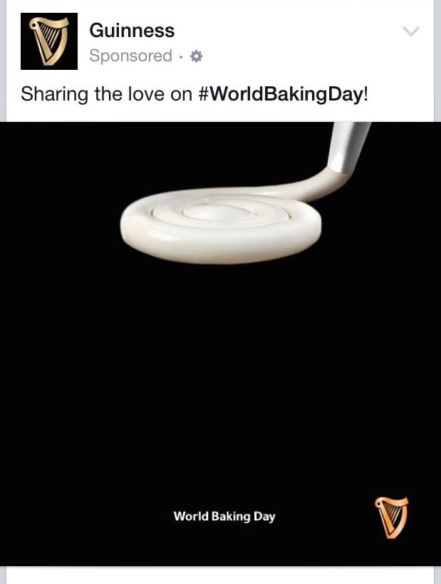
Here’s a fabulous post from Guinness created to celebrate World Baking Day. They aren’t pushing their product but are boosting brand awareness and tapping into a trend.
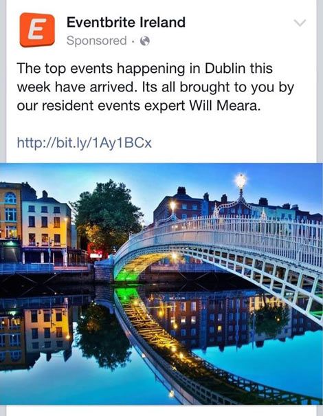
This post from Eventbrite Ireland offers real value to followers. It’s totally on message too, an event guide for the week.
5. Using ugly creative
Facebook has become a highly visual network. It’s our images that will capture the attention of our audience in the newsfeed. For that reason it’s worth putting in that extra time and effort to create something stunning.
This ad, which is purely text based (I’m not sure how this even got around the 20% text rule) just looks ugly-unlikely to capture the attention of an audience.
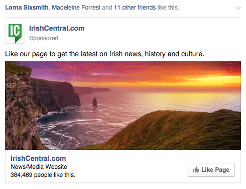
In contrast, this one from Irish Central is beautiful and eye catching. Enough to make you stop scrolling.
6. No call to action
If the goal of your ad is to get someone to click to your website, like your page or take another action you need to specify this in your ad. Adding a strong call to action can make a big difference to your success.
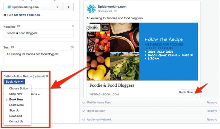
If you create a website clicks ad you have the option of adding a Call To Action button to it. You can choose from:
-
- o
- Shop now
o
-
- Book now
o
-
- Learn more
o
-
- Sign up
o
-
- Download
o
- Contact us
What I like about this is that whether users click the CTA button or anywhere else on a website click ad they will be brought to the same link. If people aren’t ready to book, they may click the image or the link itself. Those ready to take action will go straight for the button.
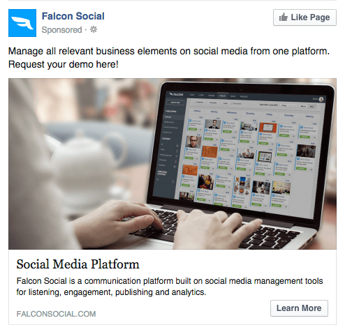
Look at this example from Falcon Social, they include both a textual call to action and a button.
Whereas this example fails to tell me anything about what I’m signing up for.
7. Not taking advantage of new features
Facebook is always introducing new ad types and new targeting options. I’ve found that if you jump on these close to release you get far more value for your money than regular ad types.
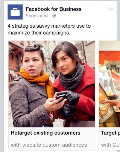
For example, when Facebook first introduced their multi-product ads (pictured below) I saw a really good click rate.
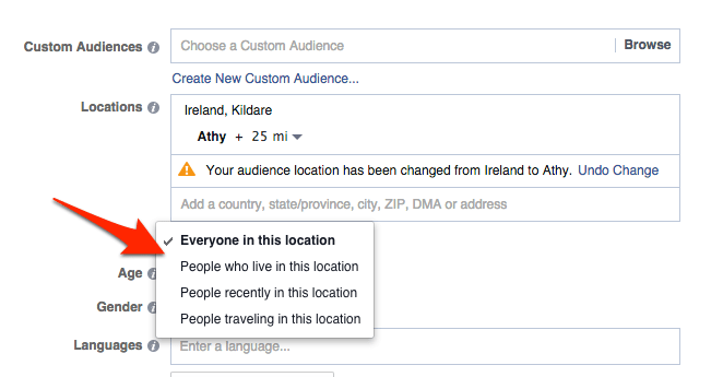
Keep an eye on updates and try them out. The most recent is the ability to target ads to different segments of people in the local vicinity.
You can choose from:
-
- o
- Everyone in this location
o
-
- People who live in this location
o
-
- People recently in this location
o
- People travelling in this location
8. Not tapping into trends
I’ve written about the importance of newsjacking or trend-jacking before. Facebook is keen to promote trends, so if you can create a clever ad that taps into one you should see good results.
The Guinness ad I showed you earlier is a good example. It’s part of a series of ads they’ve produced with similar graphics.
Glenisk created this eyecatching ad to tap into the #YesEquality campaign for the marriage referendum in Ireland.
9. Not looking for interactions
The more people interact with your page posts, the more they will see from you in the future. We tend to forget about this when creating ads.
Boosting a post that is aimed at getting people to interact with your content will help you get more organic reach on that and future posts. I’ve seen great results from just spending the minimum €1 on a boost.
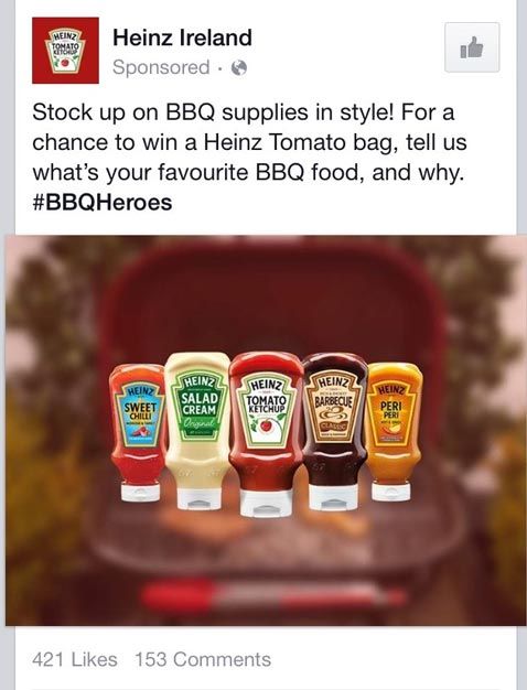
This example from Heinz asks a question that should both get people interacting and thinking about barbeque season.
10. Targeting people who already like your page with Like ads
I see these a lot in my newsfeed and thought it was due to bad targeting.
Then I saw it happen to one of my clients ads.
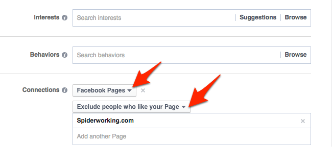
Make sure your ad is targeting only people who don’t already like your page.
There seems to be a glitch that changes this option mid ad campaign to ‘everyone’ so keep an eye on it.
11. Not promoting sales posts
As I mentioned earlier Facebook changed the news feed algorithm in January and limited the reach of promotional posts. Essentially these are posts that include words like ‘book’ or ‘buy’. If you want to promote your business, products, services or events on Facebook you must now boost those posts.
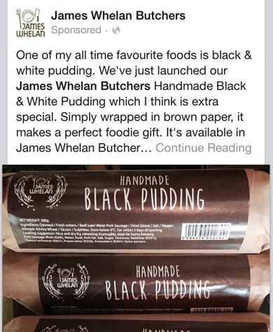
James Whelan Butchers used this option to promote a new product
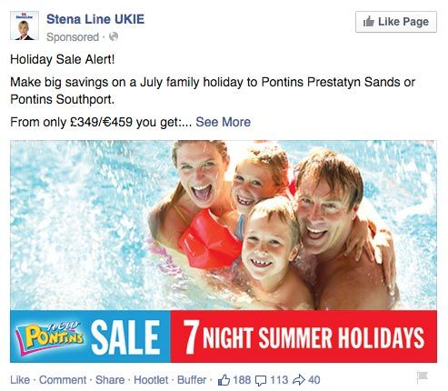
And this offer from Stena UK & Ireland is an eyecatching promoted post.
12. Not previewing your ad
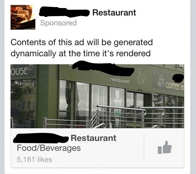
I made this mistake in one of my first ad campaigns. It was a typo, and as you can imagine, Facebookers were keen to point it out to me. I was a bit red faced but probably not as much as whoever created this ad.
It looks like they were trying to create a multi-product ad but instead created a ‘Dynamic product ad’. Now they are spending money promoting this business to a targeted audience who don’t have a clue what they are offering.
To avoid making mistakes, look at your preview in all formats and if in doubt get someone else to proof read it for yiou.
13. Not having a strong landing page
I can’t emphasise this enough. If you are going to spend a lot of time crafting an ad to sell something, make sure you are sending people to a good quality landing page. Sending people to the homepage of your website and hoping they will know what to do is not enough. Make sure when people arrive on your website after clicking the ad it’s very obvious what they have to do next.
There are lots of tools out there that can help you create landing pages. Unbounce is a popular solution and is crammed with features for improving conversions. If you are on a lower budget and use WordPress try Thrive Content Builder. I’ve just started using it on my website and find it very user-friendly if not as feature rich as Unbounce.
If you are running ads on Facebook take the time to put together a budget and plan for your advertising. Decide how much of your budget you will spend on promoted posts, Like ads and website click ads.
If you need more about Facebook advertising, check “How to get the most from your Facebook advertising” blog post.
Spend time creating an ad that is visually attractive and is designed to fulfil the goal you have set for it.
Keep an eye on your results so that you can tweak if it’s not working and most importantly of all preview and proof read.
Your Turn
Have you made any of these mistakes with your Facebook advertising? Have you seen anything like these examples pop up in your newsfeed? I’d love to hear about your experiences.
