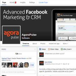
Finally! It’s rolling out to everyone: the New Facebook Page layout that was originally announced in March is going to be released to all pages on June 6.
It took Facebook 3 months instead of the 1 month they had initially announced; probably because of the many bugs they had to fix (we spotted several serious issues in this blog post).
Now that this new layout seems to be the final one, we’ve installed it on several of our pages and made a detailed list of all the major changes that you need to be aware of.
Here we go:
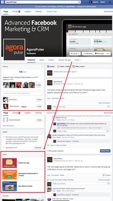
#1 – Apps tabs are still present on your page, but they are below the fold
Applications’s tab images used to be located on the top of the page, above the fold. With the new design, the applications’ tab are now located on a block in the left column and way below the fold. There is no doubt that the visibility is not as good as it used to be.
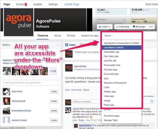
#2 – All apps are still in the top menu, but hidden behind the “more” dropdown
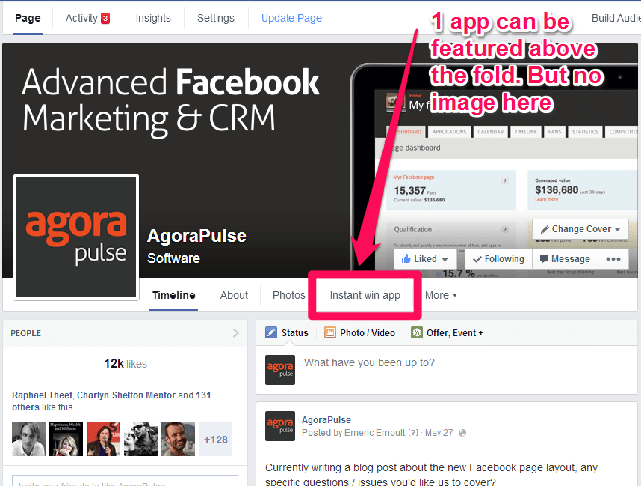
#3 You can have one app featured on the main menu, above the fold, but only one, and no sexy visuals here
ERRATUM: You can actually add 2 apps in the menu! My mistake. Only the “about” menu cannot be moved dwon the list 🙂
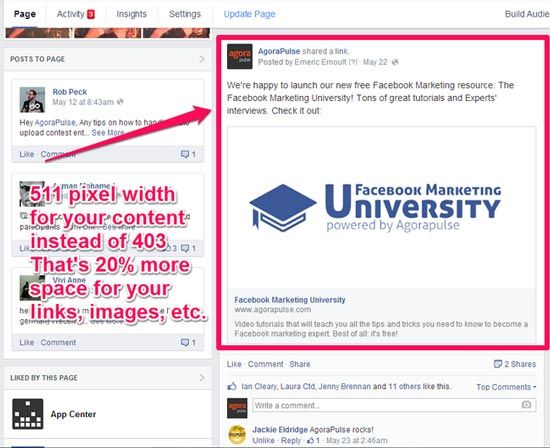
#4 – The content from the page is now clearly displayed in one single column
That one is part of the “bottle half full” part of this new design. The content gets more space with 511 pixel in width instead of 403 pixels in the previous 2 column layout.
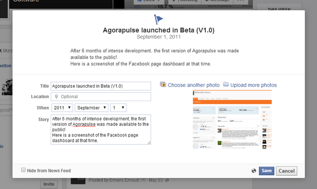
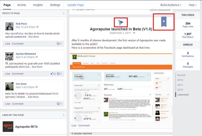
#5 – You can still create milestones, but they will not be displayed in a large layout anymore
Milestones can still be added to the page:
They will appear as a milestones, but they will not be displayed more prominently than “regular” posts like they used to be, the width is now the same for every type of post:
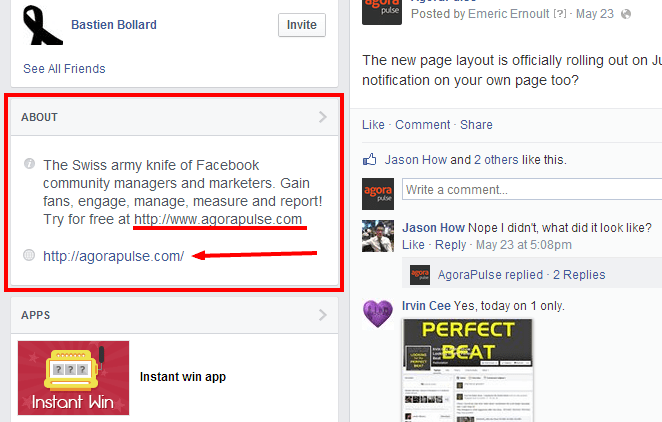
#6 – Your website URL is now always displayed in your about section
No need to count the number of words in your “about” section anymore to make sure you have your URL appearing on your page, it is now displayed prominently. And it’s clickable too! That’s a little plus, but it’s a plus!
#7 – You can view the details of every left column block right from the page
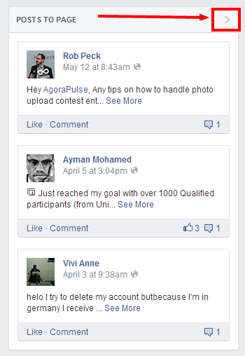
A convenient arrow acts as a “view more” on each left column block:
#8 – you can re-order all the blocks on the left column, but “people” and “about” have to stay on top
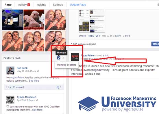
First go to the “manage” button (the pen icon), then click on “manage sections”. Not very convenient, a single click on the pen should suffice, I don’t really see the point in having a drop-down here as there’s only one item in it:
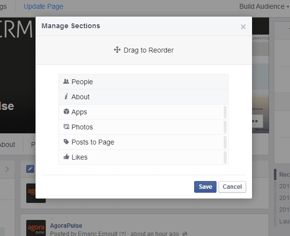
You’ll have access to a “drag & drop” interface where you can re-order the block on the left column. Note, however, that “people” and “about” will always be on top, you can’t move these two blocks down:
#9 – it is now easier to respond to fan posts
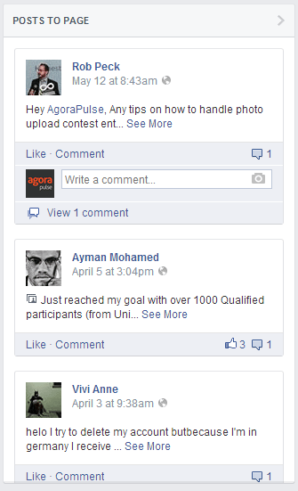
It is now easier to comment on fan posts. They are clearly displayed on the left column and the comment button is immediately available. In the previous layout, fan posts were mixed with other stories, such as page mentions, and were harder to spot. Also, you had to open the “recent posts by others” before you could respond to your fan post with a comment. You’ll save a click!
#10 – Posts mentioning your page are now a bit hidden
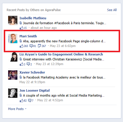
The post mentioning your page used to be prominently displayed on the timeline in the “recent posts by others” box:
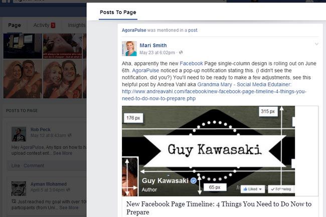
This is not the case anymore. If you want to see a post mentioning your page, you need to dig a little bit more now: go to the “posts to page” block and click on the arrow on the top right to see all the posts, including the mentions this time, in a pop-up:
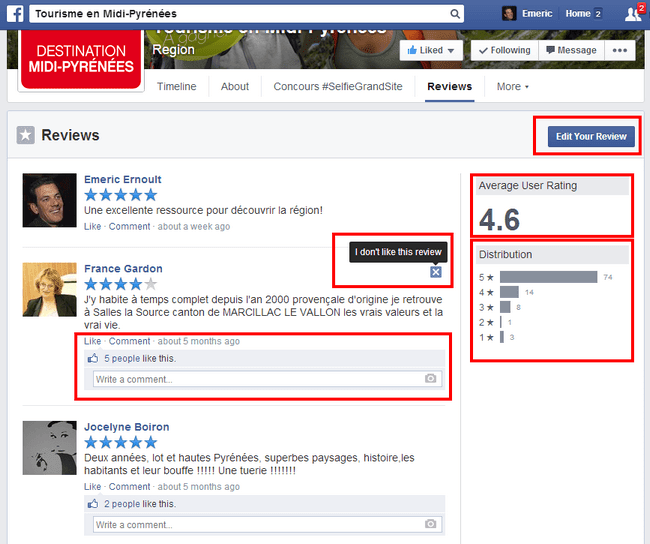
#11 – Average reviews are now much more visible and there is a new review “full page” view that really rocks!
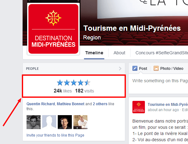
The average review is displayed very prominently on top of the left column (only if your page is a “place”):
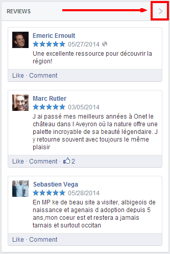
And when you click on the “view more” arrow:
You have access to a full page view of all the reviews where you can see the average review, the split for each review “grade”, see all the review with ease and respond to each of them. Good stuff:
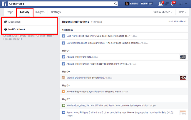
#12 – All notifications are now easily accessible in one convenient page
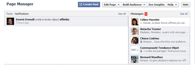
In the previous layout, you had a block on top of the home page with 2 different places to check: messages and notifications: 2 places not conveniently linked to each other:
Now, they are both under the same roof: activity
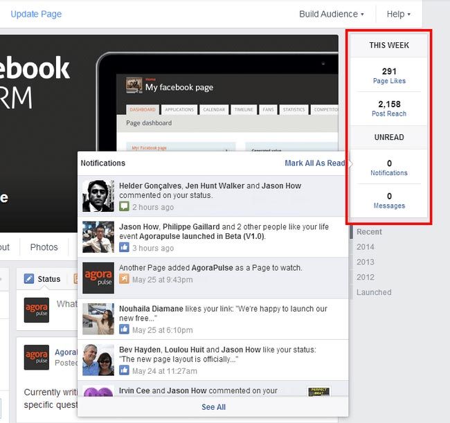
#13 – Quick access to your most important notifications
You can quickly see if you have a new message or notification waiting for you without checking the activity menu. You also have a quick overview of your likes and post reach for the last 7 days:
#14 – All your page settings are in one convenient place
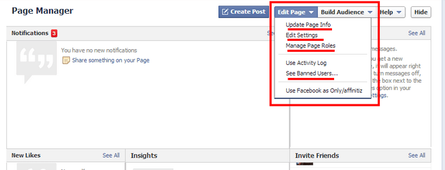
In the previous layout, the settings were a bit all over the place: manage roles, edit page info, edit settings under the same dropdown. Quite confusing.
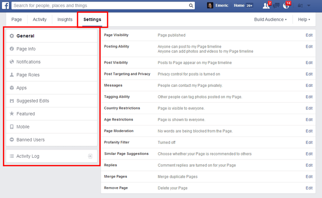
Now, everything is conveniently grouped under one single tab menu: settings
#15 – activity log and banned users were moved to the unified “settings” tab”
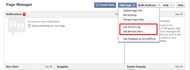
Banned users and activity log used to stand alone under the “edit page” dropdown. Not really any good reason for that:
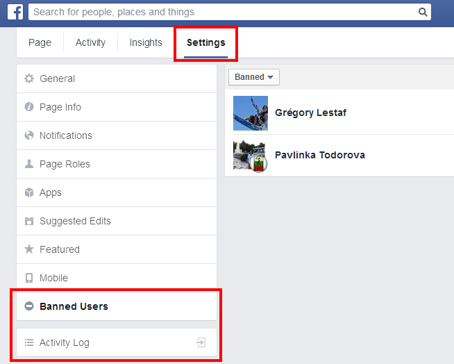
Now, they’re both included as a sub-menu under settings, makes more sense:
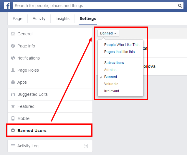
#16 There’s a lot more than “banned users” under the “banned users” menu!
That’s a tricky one! Under settings, you have a “banned users” menu, but when you click on that menu, you have a drop down menu on the right where you’ll see:
-
- o
- People who like this (your fans),
o
-
- Pages that like this (pages that have liked your page “as a page”),
o
-
- Subscribers (no idea what this is, since you cannot “subscribe” to a page but only follow it, which is the default setting when you like a page. Another Mystery!)
o
-
- Admins (easy one),
o
- And finally: banned.
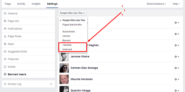
There are also “valuable” and “irrelevant” in that menu but I’ll get to that later.
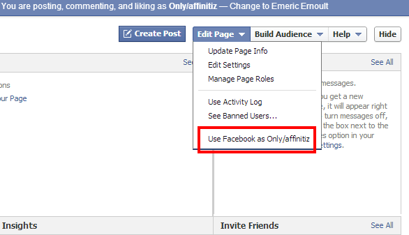
#17 – No more “use Facebook as [your page] in the settings menu”
In order to use Facebook as a your page, you used to have a specific link in the settings menu of the page:
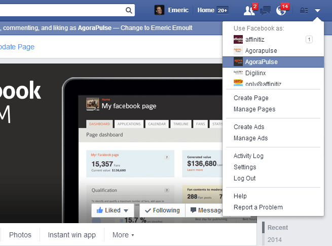
This link has vanished. To use Facebook as your page, you now have to go on the top navigation bar, click the drop-down menu at the top right and select the page you want to use Facebook as. If you manage a lot of pages, this may be a little confusing.
#18 – fan list now includes “irrelevant” fans and “valuable” fans. What this means remains unclear!
If you look at your “banned users” menu in the settings, and click on the dropdown menu, you can see that there are 2 filters at the bottom, one for “valuable” and one for “irrelevant”. This sounds interesting but I have no idea what these mean and there are no users under these two views.
Is Facebook preparing a filter to show us our “inactive” fans and “most active” fans? Maybe…
That’s it for the list!
I didn’t go over the insights and “page to watch” part since they have not changed at all under the new layout.
Your turn, do you like this new layout? Have you noticed changes that I’ve missed? Let me know!
