Social media is visual. Blah blah blah. You might riding the “visual social” wave if you have design talent, speed, and a big “visual content” budget. But truth is, most of us are lucky to have just *one* of those attributes. Or perhaps you use Canva. This tool helps you quickly make affordable graphics that look great.
How Canva Makes Images Quickly
Register for free and log in to your homepage. Immediately you’ll see dozens of image sizes that are designed specifically for Pinterest graphics, Facebook ads, and tweets. No more fumbling around for the latest size dimensions for your commonly used social networks!
Canva also stores your images so that they can be updated at a later time. Since we publish in French, Spanish, and Portuguese, we rely on Canva to hold our blog header images and easily translate the titles that we overlay on them.
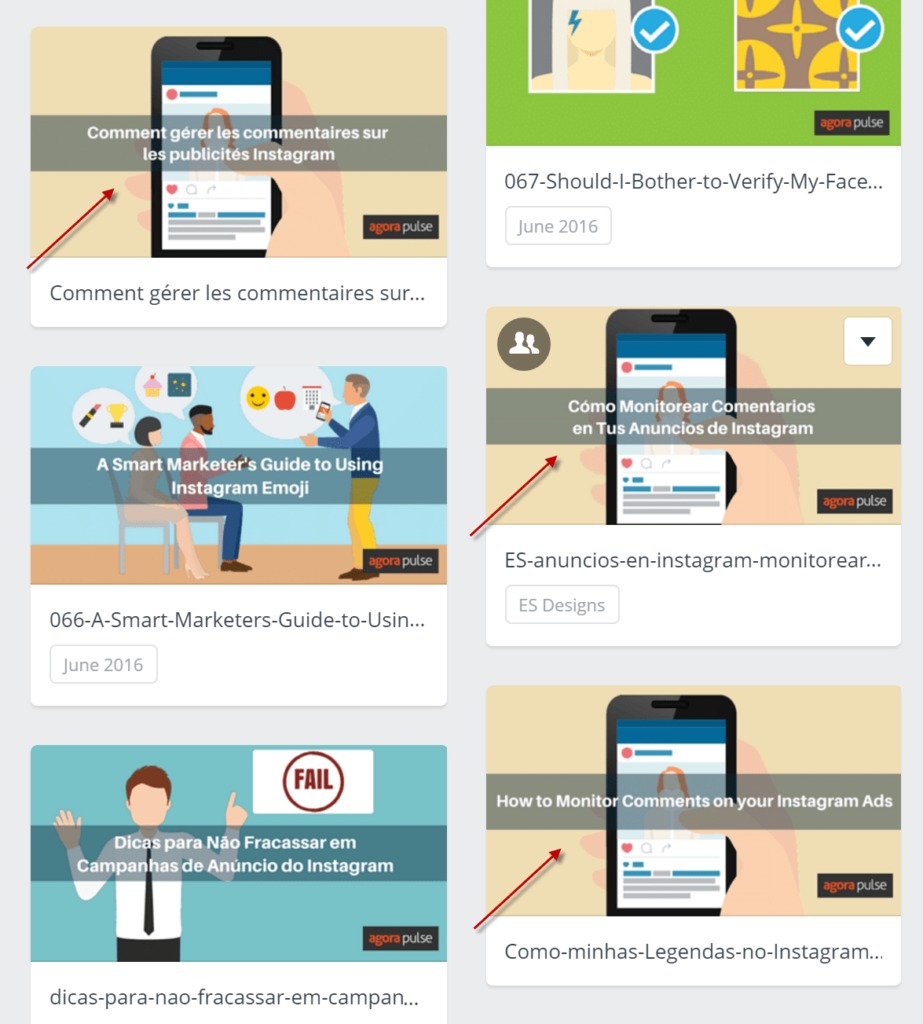
Canva helps us easily maintain our visual branding in four different languages.
How Canva Makes Images Affordable
Here’s what’s totally free to do on Canva:
- Sign up for an account
- Upload and use your own images
- Use Canva’s fonts for any text you want on the image. Note: These aren’t your standard Times New Roman / Arial fonts. You’ll have to play around with what works best for your brand. (There’s also an option to upload fonts you may own and need for branding.)
- Select and modify hundreds of lines, frames, grids, chart, and infographic-looking shapes for your image
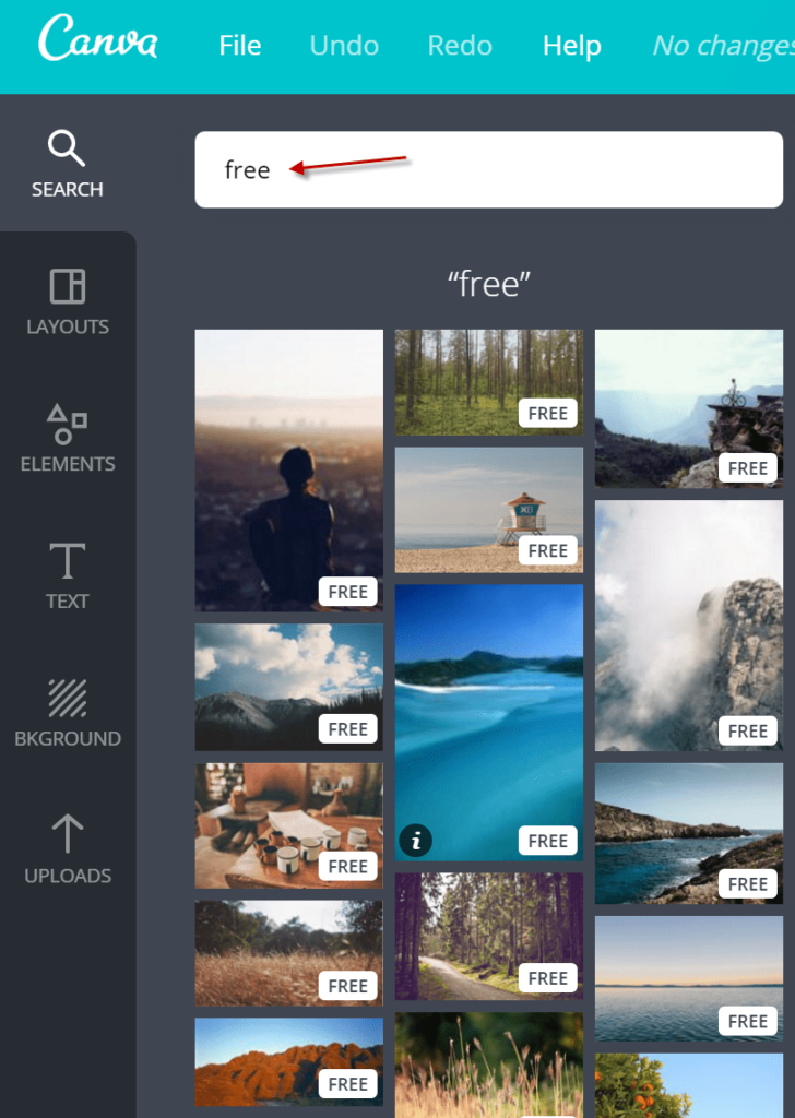
When it comes to including photos, Canva gives you access to over one million royalty-free pix. Most of the images are just $1USD a piece for a one-time use license. But if you’re all about free, type “free” in the search box.
Might one of these work for your post?
Related read: Publish Canva’s AI Images Easily With Agorapulse
How Canva Makes Images Good
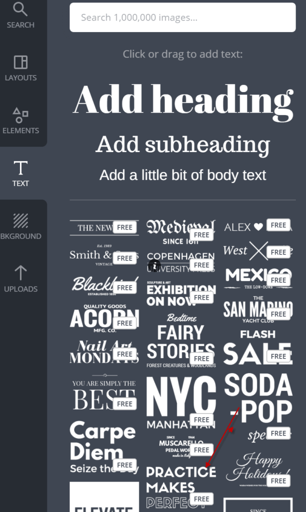
The text option allows you to have a text-only image or overlay text on a photo or illustration.
I like occasionally using the premade text templates when I want to get fancy. See, I’ve heard about “font pairing,” but Canva actually knows how to do it in these templates.
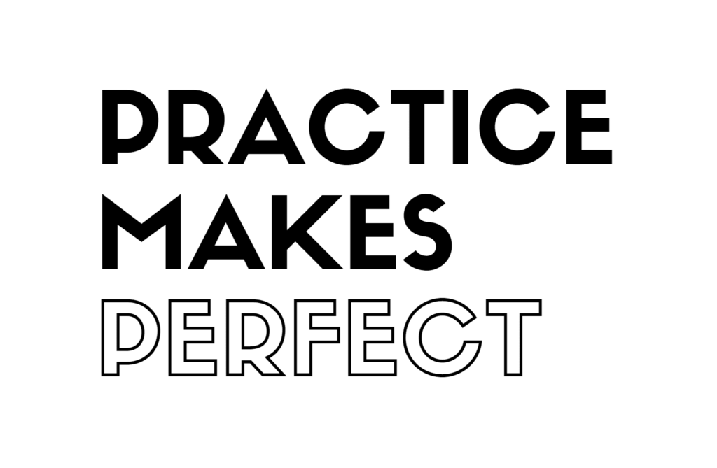
Select what you’d like from their menu. I’m going to play with “Practice Makes Perfect” near the bottom.
My audience of say, strong moms might be inspired by this message.
Or they might appreciate the truth behind this one.
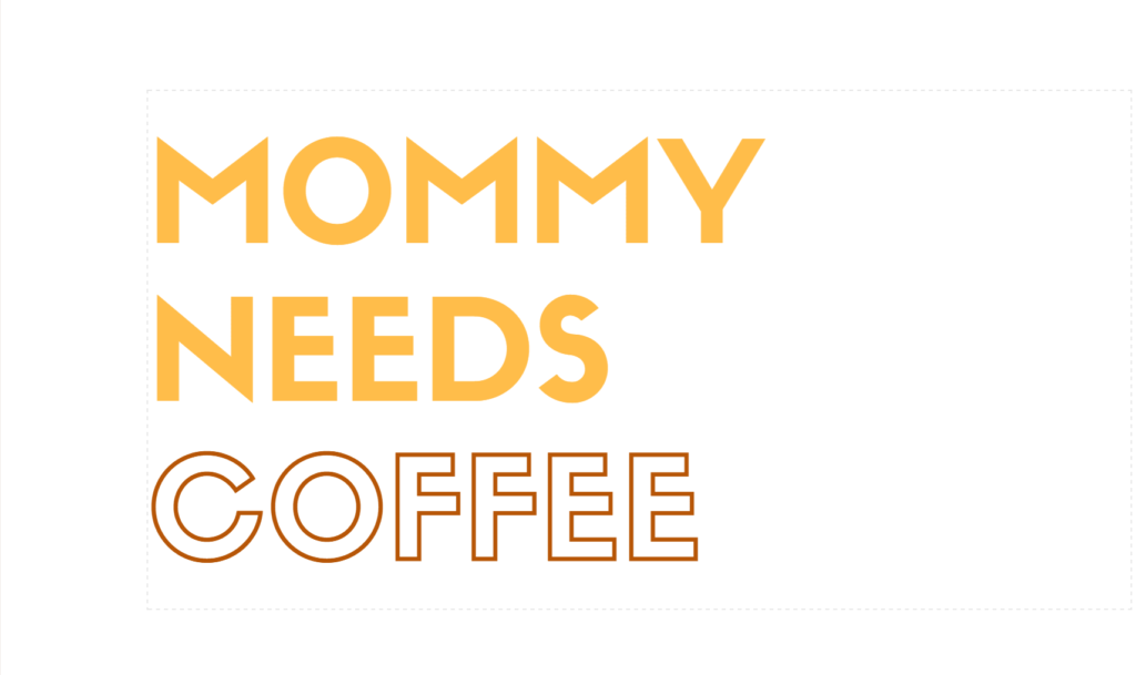
It took me eight clicks to change the “perfect” image to the “coffee” one. And both look pretty good I must say!
If you plan to use Canva to make visuals for Facebook ads, you’ll love the built-in 20% tool. Some people say that the rule is on its way out (hooray!), but in the meantime, you can add this overlay to see if text is taking up more than five of the squares.
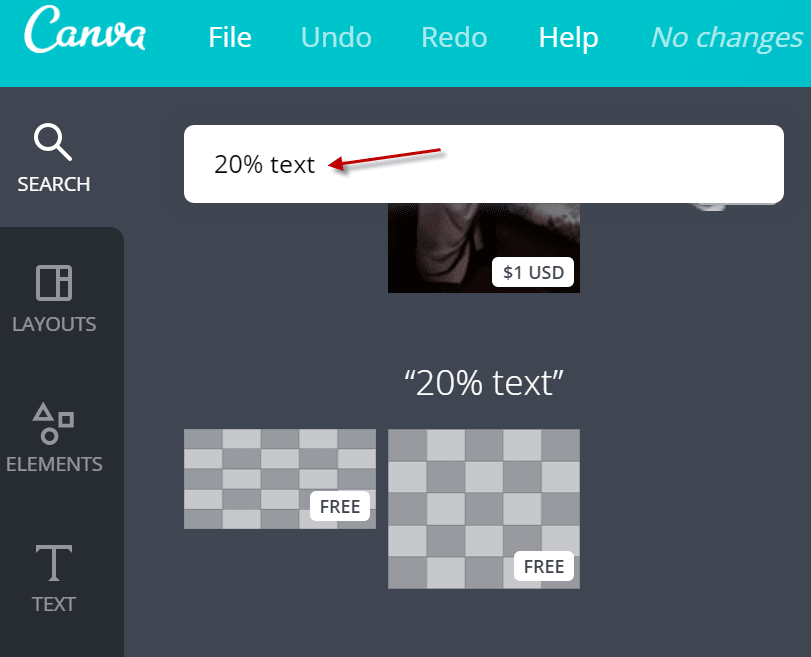
Simply go to search and type “20% text.” You’ll instantly see two options for checking to see if your text takes up less than twenty percent of your ad’s image.
Facebook will appreciate that you stuck within its promotional guidelines. And you’ll appreciate not having to fiddle with your image over and over to make Mr. Zuckerberg’s team happy.
Sign up now for a free demo of Agorapulse and see all you can do with our Canva integration.
