What do you focus on most for your Instagram social media strategy?
If you’re like the majority of marketers, the answer to this question is the visual content, of course. You’re working to create engaging, stunning images and videos that will capture user attention in the feed and Stories alike.
Sometimes, however, we end up focusing exclusively on each individual post, paying attention to every tiny detail—but forgetting about the big picture. Most brands completely forget about how their content looks all together when users visit their profile and check out that grid view.
With the right strategies and scheduling tools in place, though, social media managers can easily create individual posts that perform well and also fit into a larger scheme of a cohesive, appealing grid view.
In this post, we’re going to look at specific strategies for how you can rock your Instagram grid view to attract new followers and customers.
Why Does the Instagram Grid View Matter?
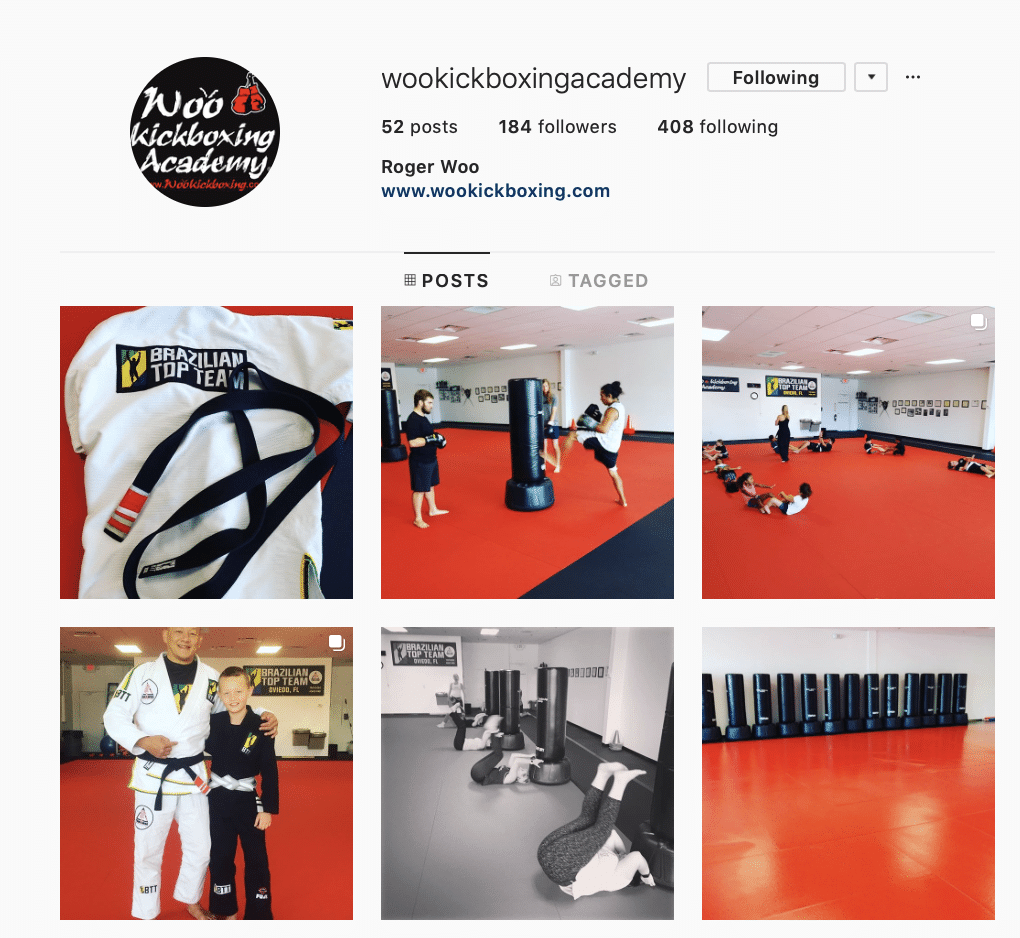
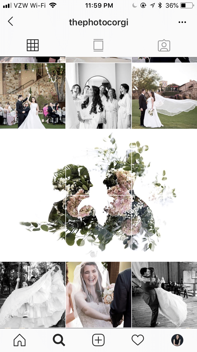
The Instagram grid view is what people see when they look at your profile at once—not just a single post—seeing all your individual content lined up together. Instagram users see each post in rows of three, lined up side by side.
This is true for both desktop and mobile, though the space between the posts is almost non-existent on mobile, as you can see in the image below.
The Instagram grid view can be hugely important because it’s what people will see when they visit your profile.
A strong grid view can encourage them to click on your bio link or check out more of your on-platform content, enticing them to learn more about you. It’s a key part of having a visually appealing profile.
Instagram is all about the visual, so the grid is something you should keep in mind.
Here are a few Instagram strategies you can use to make your grid view stand out and help it attract new followers and new customers alike.
Establish a Cohesive, Branded Look
About 60% of brands use the same filters in all of their images. That decision is not just about keeping it easy like Mark Zuckerberg’s no-decision-making wardrobe strategy. Using the same filters help you establish a distinct, branded look. It will help you stand out in users’ feeds and give your Instagram channel a cohesive look.
A cohesive branded look makes your profile and grid view look more appealing at a first glance.
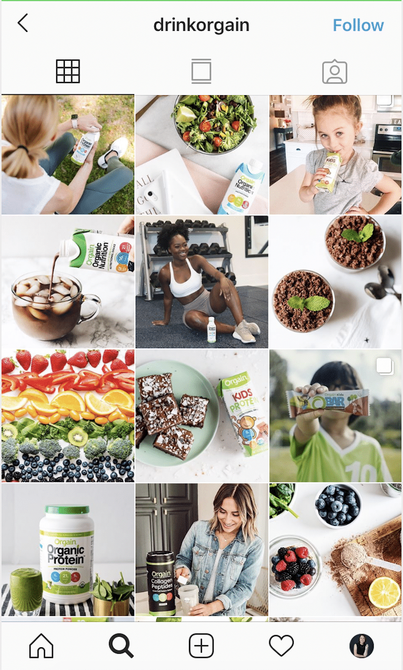
For example, Orgain uses bright, airy pictures with vibrant foods, and most of its images put an emphasis on the color green. It aligns with the company’s branded colors and is associated with the healthy, green movement, which the brand is all about.
Tell Micro-Stories, Three at a Time
A single video ad is great, but a campaign with a video series is a great way to keep users engaged and interested in what’s coming next. It also breaks up a larger message into smaller, digestible parts and increases the likelihood that your audience will see at least one of your posts.
The same strategy can work well in the grid view. Schedule three different posts focusing on the same products or telling the same stories one after the next, so that they’ll be lined up together in the grid view.
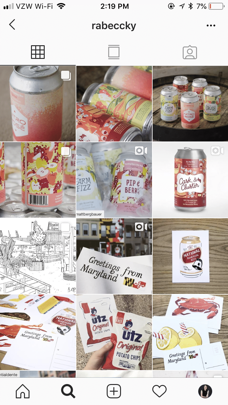
Designer Rabeccky does this with her channel, having a series of three images at a time sharing similar content that all tie in with each other.
The first example is the three different bottles she designed for different flavors of her clients’ canned wine. The second is multiple different Maryland-themed drawings grouped together. They stand out in the grid view and give the channel an intentional feel.
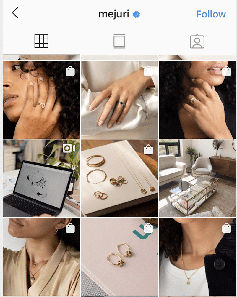
If you don’t necessarily want to tell stories but still want to use the three-post approach to create a strong visual appeal that draws the eye in, you can use a strategy like Mejuri does in the example below.
Look at the top row of images. It looks like the same woman is appearing in the two outside images. We see the black shirt, the dark curly hair, and the skin and lips that match in both pictures. In the middle, is a star white shirt and a dark blue ring. The visual color contrast between the two outside images and the center image, and the symmetry, actually work to draw your eye in. It’s visually appealing, even if you aren’t telling a full story.
Go for the Big Picture View
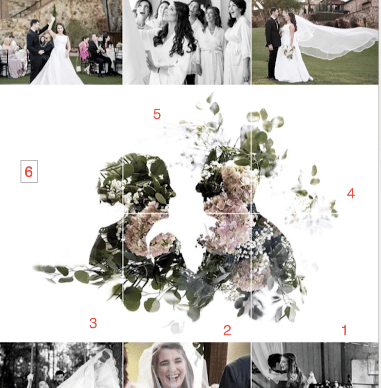
Want to do something drastic and insanely attention-grabbing? Take a single image and break it down into 6, 9, or 12 distinct images, then upload them on your profile. You’ll be met with a stunning large image dominating your Instagram grid view, and people will be sure to notice when they visit your profile.
This strategy can be a tiny bit risky for engagement, so you don’t want to use it exclusively. The individual portions of the image may not look great on their own, so make sure that you tease it with “This is just part of a puzzle—check out our profile to see how it all comes together!”
Keep the following in mind to execute this approach well. First, you’ll need to upload content in series of threes to keep these images consistent in the grid view; all it takes is one post to shift it all to the right. This is where those micro-stories can come into play and be valuable, and where scheduling ahead of time will be a good call. (We’ll talk about this more in a minute.)
You also want to make sure that you’re uploading the images in the right order. (That sounds a little obvious—but I actually saw a confused brand publish these in the wrong order and accidentally post the picture upside down!) Scheduling can also help with this approach because it gives you time to put everything in order without scrambling to do so. Here’s the order that you should use.
Use Agorapulse to Plan & Publish Your Designs
No matter which specific strategies you’re using to rock your Instagram grid view, one thing is clear: you need to be consistent and intentional about what, when, and how you’re posting.
Agorapulse can help with this. We offer both direct and manual publishing, so you can plan out your content in advance and schedule it to go live automatically or send you a reminder to do it yourself.
Scheduling gives you ultimate control and makes it significantly easier to plan out your day’s, week’s, or month’s content to ensure that your grid view will look fantastic no matter what you posted last.
* * *
Though the individual posts that you publish on Instagram should take center stage and be your ultimate priority, you shouldn’t ignore your grid view.
Factor your profile’s appearance into your strategy when you choose how you want your content to look and occasionally publish content designed primarily to make the grid view sparkle. It could be the difference between whether people just visit your profile and click away, or whether they stay to follow, purchase, or just see more.
Sign up now for a FREE demo.


