After years of imposing the square format on us, Instagram photo size suddenly changed this summer. At long last, it allowed us to post landscape and portrait photos to the network.
But why did they make this change? How does it affect what you post as a brand on Instagram?
3 Ways The Instagram Photo Size Change Will Effect Your Brand
1. Facebook Ads
When Instagram announced this update I was confused. The square photo was part of the Instagram brand. I couldn’t understand why they’d change it. It was only when I noticed the aspect ratio for landscape photos that I realized that this was all about Facebook ads.
The image aspect ratio for Facebook ads in the newsfeed, the mobile news feed and in the sidebar is the exact same as the landscape ratio on Instagram 1.91:1.
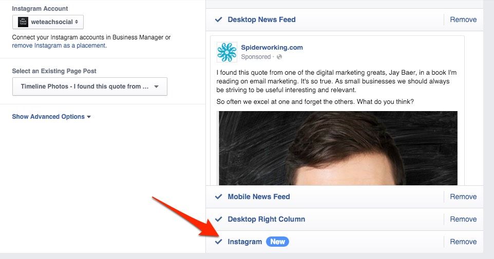
If you’ve set up an ad in Ads manager recently, you will have noticed that alongside the ‘news feed’, ‘mobile news feed’ and ‘sidebar’ options is an ‘Instagram’ tab.
This makes it easy to share the same image on Instagram as you do to Facebook. Although this is a time saver, as brands we have to be sensitive to Instagram as a network. An ad that is appropriate for Facebook may not fit the feel of Instagram. Most of the ads I’ve seen on Instagram since they made this change have jarred with the organic content. Before you dive into advertising start creating organic content and monitor what type of content works best for you.
Takeaway: When using the same image for an Instagram ad that you do for a Facebook ad, create the image with Instagram in mind. Instagram users expect a certain style and quality image. Be sympathetic to this.
2. Video
Although square video looks cool, it is hard to create. Yes, you can shoot video directly into Instagram but if you want to edit and upload it has always been easier to work in the standard landscape format. When shooting on your phone, even using one of Instagram’s own apps, you were forced to use landscape or portrait view.
Video is traditionally a rectangular format — take a look at the ratio of your TV, the cinema screen or even your phone to see what I mean. The square restriction imposed by Instagram made it hard for marketers to repurpose clips originally shot for TV or YouTube.
Although the landscape aspect ratio is similar to the 16:9 standard video, you will still need to crop slightly for your video to fit. And remember you are still restricted to 15 seconds.
It should now be even easier to promote your longer videos via trailers or clips on Instagram.
Takeaway: To avoid subtitles and text on your video getting cropped, always ensure it fits within the Instagram aspect ratio.
3. More Space For Your Story
The square is quite a restricting format. I spent many a minute trying to squeeze everyone in a group photo into the square space in front of my selfie stick. It was almost impossible to capture everyone and someone always got cropped out.
Creating a collage was also tricky. If I had two images only a sliver of each would show once cropped to a square. Unfortunately Instagram has yet to update their Layout collage app to allow for landscape or portrait images. Here’s hoping they’ll introduce it soon.
If you don’t want to wait, the Diptic app for iOS has a 99c upgrade that allows you to create Landscape and portrait collages. Rhonna Collage also for iOS has some pretty cool collage formats including video, that you can create in landscape and portrait ratios.
The Android app ‘Photo Collage’ also has landscape and portrait options.
The wide photo format is better for storytelling. A square frame limits us to foreground and background. A landscape gives us left and right as well.
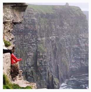
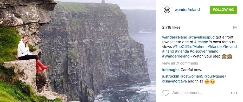
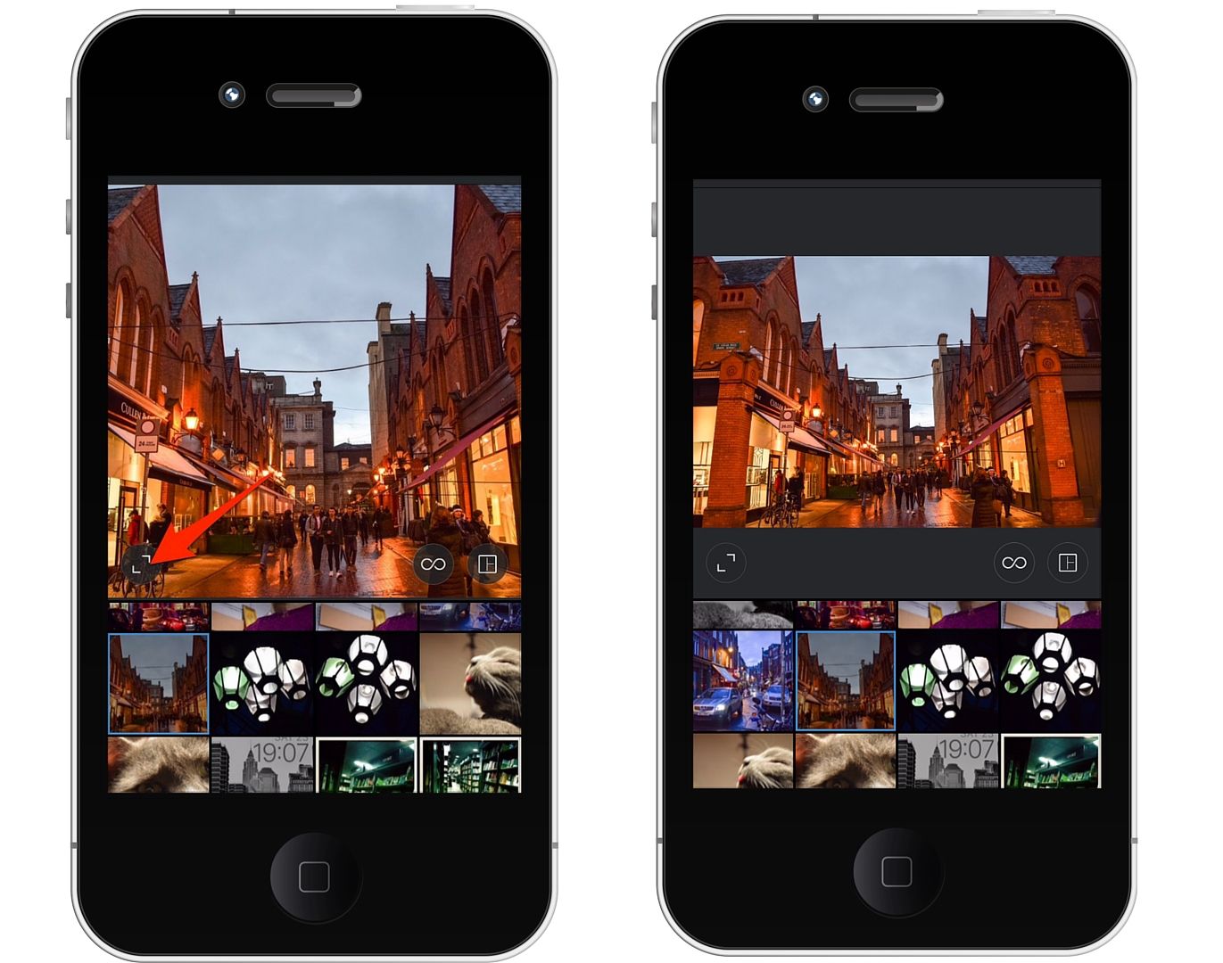
Look at this example from WanderIreland. Cropped square it’s hard to get the full impact of the shot.
When I open and expand it to landscape, I feel the fear.
Takeaway: Use the extra space in the frame to add to the story or create a collage.
Now let’s get into the how-to of posting the correct Instagram photo size for landscape and portrait images.
Instagram Photo Size Change: What You Need To Know
As I mentioned, you are still restricted to a maximum aspect ratio.
- For landscape (horizontal) images, this is 1.91:1
- For portrait (vertical) it is 4:5
Translate that into pixels and you are looking at images and videos that are ideally:
- 1080 x 608 for landscape
- 864 x 1080 for portrait
I use this handy Pixel Aspect Ration Calculator when choosing image sizes for my photos.
Note: Although image and videos show in the stream in their full glory, they are still cropped to a square and centred in search results and on your profile.
How To Post Landscape & Portrait Photos To Facebook
Landscape and portrait images and video only work when you upload your file to Instagram. If you are shooting straight into the app, you have no option but to stick within the square.
When you upload to Instagram, click the arrow to the bottom left of the photograph — this will show your image at the maximum aspect ratio that Instagram allows. Click it again to return to the square. If you want to adjust the cropping, pinch the image in or out with your fingers.
Note you don’t have to use the maximum aspect ratio. You can crop to any size between the square and the maximum allowed for the format you have chosen.
Conclusion
The new Instagram photo sizes open up lots of opportunities for better photography and storytelling. Although most users still seem to be sticking to the square format at the moment, I can see many more embracing wider and longer photos in the future.
As businesses we have to ensure that whatever the size of our photo or image we are sympathetic to the network and its users when posting. It’s time to get creative!
Have you experimented with Instagram portraits and landscapes yet? Do you like the new format? Let us know in the comments below.
