After more than 4 years listening to our users, we know that managing social accounts can be a real headache. Did every message get a response? Who replied to M. Doe’s private message? Are we missing any opportunities on Twitter?
Keeping on top of all this can daunting at times.
To help you regain control (and your sanity), we launched our Social Media Inbox in March 2015. Thousands of businesses are using it every day and saving a LOT of time.
Today, we’re making a major upgrade to that Inbox: it is now mobile! (on Android and iPhone). We completely revamped our interface to make it even easier to use.
Did I mention that Facebook pages are now synchronized in real time?
We didn’t stop our improvements with our Social Media Inbox. We’re also releasing a brand new publishing app with an easy-to-use editorial calendar as well as a convenient content queue to save you even more time.
1. A new design: fewer clicks to help you do your job faster
When we started this redesign in August, we had two goals in mind: remove friction and make it easier and faster to get to where the action is, and, improve the look & feel.
No more dashboards
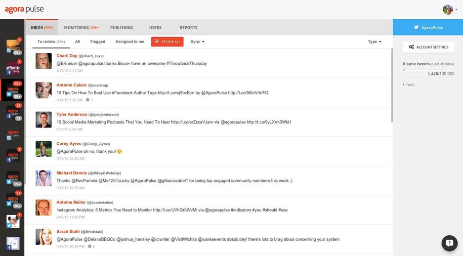
The main dashboard, as well as all accounts’ dashboard, are gone. You will get directly to the Inbox of the first account on your list.
The main dashboard is technically replaced by the left menu. This is where you can easily access all your accounts and see your notifications. The improvement is that this is always visible and makes it much easier to navigate from one account to another.
More accessible features
All the features linked to each Social accounts are now displayed horizontally on top. You go from one account to the over on the left, from one feature to the over on top. Simple. Also, when you change accounts, you’ll stay on the same feature. Let’s say you want to download all the reports of your 5 Facebook pages. It will now take just 5 clicks instead of the 15 you had to do before!
2. A brand new publishing system
We used to have two menus for the publishing features (publishing and calendar). They’re now grouped together in one handy setting.
An efficient content calendar
This is the command center of your content. You can easily see what’s been published in the past, what’s scheduled for a future date and what’s in your content queue.
A content queue to save you time
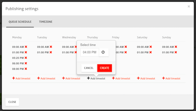
Define the days and times when you want your content to go out, add content in the queue in bulk, all at once and forget about it. We’ll do the rest.
3. Facebook real time sync
Your Facebook messages, comments and posts will now be synced in real time while your using Agorapulse. I can see you smiling 🙂
No more waiting for that response, or going to Facebook to see it. Finally!
Draft mode
When a user doesn’t have publishing rights to create a post for your Facebook page, that post will be saved as a draft. You’ll be able to approve it by going to the draft queue and publishing it.
4. A mobile app for your phone or tablet
A design you’ll be familiar with
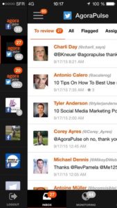
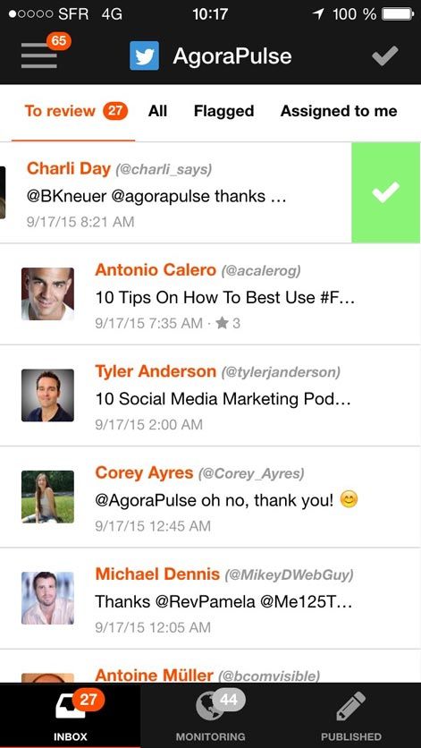
You’ll feel at home: the Agorapulse mobile app looks exactly the same as the web app. Your social accounts are on the left menu. And you’ll see the same notification system and all the filters are on top of each account.
Manage your Inbox and Monitoring items with ease
Once you’ve installed the app and connected with your Facebook profile, you’ll see the exact same accounts you’ve previously installed on the web app. Click on any account to display its Inbox or Monitoring items.
- Inbox: all your incoming messages (comments, posts, private messages, mentions, …)
- Monitoring: all the items resulting from your monitored searches, retweets, shares, mentions, checkins, hashtags, –basically, a pool of content that others have published about your brand
- Published: all the content you have previously published
From the list view, you can approve each message one by one, or all at once.
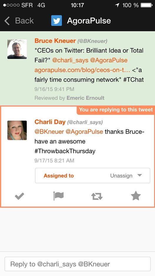
Tapping on any item will take you to the conversation view. From there, you’ll be able to:
- Approve the item
- Flag it
- Retweet it
- Favorite it
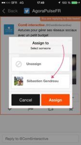
- Assign it to another team member
- Reply to the user
You can also see a user’s profile by tapping his or her name.
Available on Android and iPhone
The Agorapulse mobile app is available both on the iPhone and Android phones. It is free to try and use with your existing Agorapulse subscription.
Let us know what you think of these improvements to Agorapulse!




![Feature image of 2024 in Review: Agorapulse New Features That Made Work Better [Infographic] Feature image of 2024 in Review: Agorapulse New Features That Made Work Better [Infographic]](https://static1.agorapulse.com/blog/wp-content/uploads/sites/2/2024/12/EN-New-Favorite-Agorapulse-Features-of-2024-Blogpost-Header-1200x508.jpg)

![Feature image of Agorapulse 2023: The Newest Features of Our Social Media Management Platform [VIDEO] Feature image of Agorapulse 2023: The Newest Features of Our Social Media Management Platform [VIDEO]](https://static1.agorapulse.com/blog/wp-content/uploads/sites/2/2024/01/Agorapulse-Features-Wrap-Up_-2023-Blogpost-Header-1200x508.jpg)