An infographic is more than just pictures and text. An infographic combines images and texts that work together to present an idea clearly. Here’s a look at how to make an infographic that gets spread far and wide on social media.
As the world of social media expands, more companies, bloggers, social media managers, and influencers try to use social media to keep their audience engaged.
However, not all of them manage to achieve increased audience engagement.
In this guide, I’m giving you six tips on how to use infographics to keep your social media audience active.
- Be topically relevant
- Maintain a good text-to-image ratio
- Establish credibility
- Include visual flow elements
- Test your font for readability before you publish
- Create a catchy headline
Let’s get right into it.
Tip 1. Be Topically Relevant
The very first tip I want to share with you has to do with choosing the right topic. You should always make any visual components that you use in your post relevant to your topic.
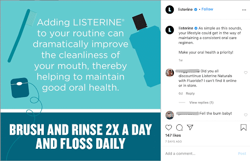
American brand Listerine shares infographics on its social media fairly often.
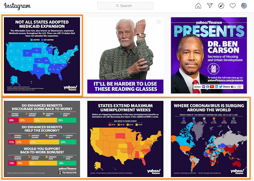
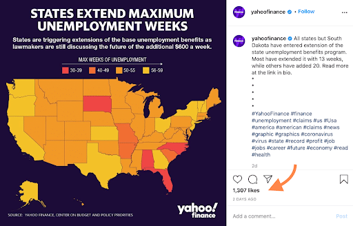
Yahoo Finance also uses the power of infographics to post its content on its Instagram account, making their account more interesting.
I’ve highlighted the number of likes on one of the posts to show you the level of engagement.
Also, make sure components within the post are relevant to each other and create a piece of content that makes sense from beginning to end.
Let’s break it down.
Examples of how to make an infographic that’s relevant
We’ve recently published a blog post that captures the idea of posting a content piece on your blog relevant to your topic as well as to what the brand does and features its products.
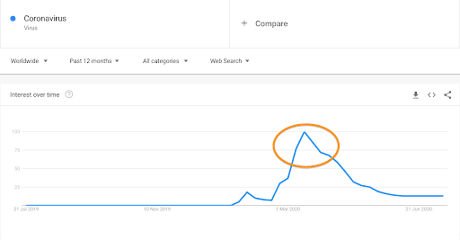
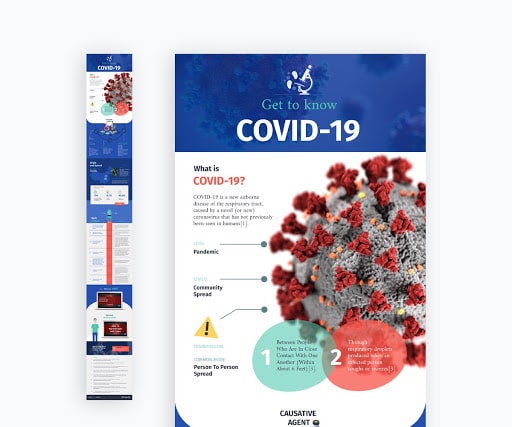
The What Is Coronavirus (COVID-19) post is, first of all, relevant to the worldwide phenomenon of the pandemic. That makes the piece of interest to a number of people across the world.
The Google Trends graph below shows the upward interest in the term during the spring of 2020, making the publication of a post that discusses the topic extremely relevant and almost necessary in its inclusion for our company.
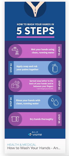
Moreover, the content piece includes a highly compelling infographic that increases engagement because it provides valuable information in an eye-catching way.
What’s really important here is that the infographic is not only relevant to the post topic but also relevant to what Visme does. (You want an infographic that also displays what you can do, whether for your social media agency or for your clients.) The infographic above is a representation of one of the many capabilities that Visme offers as a piece of graphic design software.
Such visual components can be very effective in terms of audience engagement when posted on social media platforms.
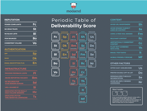
Let’s look at another example. This one comes from email marketing software Moosend. The brand published a post on email deliverability. Alongside good content, the post gives a well-made visual that definitely increases the engagement rate.
Why is the table above important?
The brand is making a clever move to include a beautiful visual that provides relevant information to the topic of the post and visual information on the service that the brand offers.
As a result, the target audience of the content piece gets the opportunity to learn something new in relation to the topic of the post and also comes closer to the company’s services.
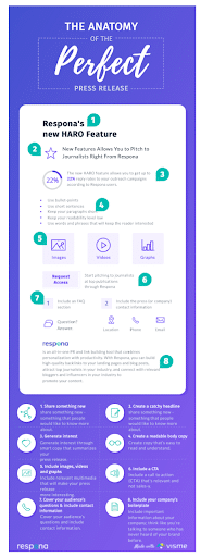
The last example I want to draw your attention to comes from PR tool Respona. The post provides valuable content about writing a press release by explaining the process, step by step.
In the post, we find an interactive infographic that gives great content in relation to the topic but also showcases a new Respona feature, increasing the audience’s engagement.
Before we move on to the next tip, keep in mind that relevance in addition to interesting visual components can really fire up the engagement of your posts.
In regards to Instagram or Facebook posts, tweets, or any other type of content that you wish to share online, remember to create good content that also showcases your best features and services in engaging, visual ways whenever possible.
All the examples I’ve given you in this section include infographics that can be used to illustrate your blog posts and also stand as individual social media posts.
Tip 2. Maintain a Good Text-to-Image Ratio
Simply put, there needs to be a balance between images and text within your posts.
To increase engagement, you have to make sure that your posts are not boring for your audience. You shouldn’t write long texts that no one will bother to read through to the end.
On the contrary, combine images with text and be as clear as possible in terms of communicating your message.
Examples of how to make an infographic with a good text-to-image ratio
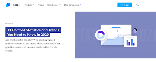
Let’s discuss the following post example from the live chat platform Tidio.
As we can see on the screenshot above, from the very beginning of the post, there’s a balance between image and text.
Images are necessary for all visual learners and people that get easily distracted when reading content pieces. Their presence is absolutely necessary, but they shouldn’t overshadow text, which is the main body of information.
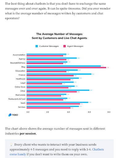
Below, I’m showing you a clever way to combine both effectively. The image comes from the chatbots statistics post I mentioned earlier.
The bar chart above, as well as the ones I’ll be showing you next, are some of the visuals that are included in the post.
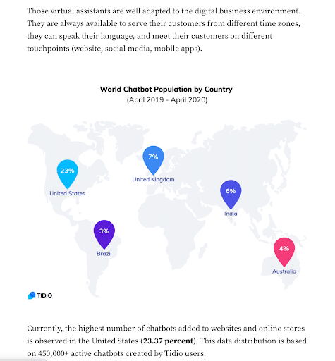
Like this map.
And the graph below.
All the screenshots above show us how we can use the text before and after an image to explain a graph and give some additional information on the topic, along with giving essential information in inventive, visual ways.
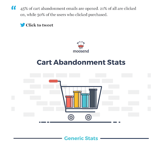
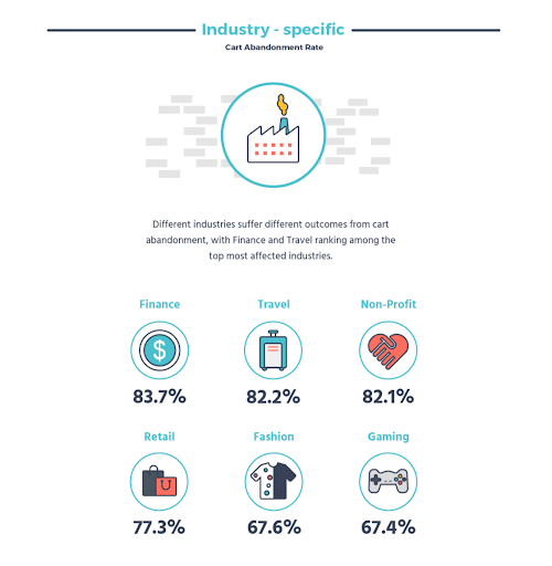
Another example that’s rather different from the previous ones, but still effective in terms of audience engagement, is the infographic on cart abandonment rates by Moosend.
The post includes some paragraphs that contain valuable textual content in relation to the topic. However, the rest of the content piece focuses on providing visual information by sharing an aesthetically pleasing and playful infographic.
It gives some very interesting stats that are well-made and easy to read.
The information that the stats point out would be very hard to express in a text-based way without ending up being boring.
Below, I’ve included an infographic template that can be your guide in terms of what the balance between your visuals and text should look like.
Now that we’ve discussed some examples of how and why you should maintain a good text to image ratio, and not solely focus on either one of the two, we can move to the third tip I have for you.
Tip 3. Establish Credibility
Establishing credibility should be an essential part of your content marketing strategy and social media marketing. It makes your audience trust you more and therefore engage more with your content.
Examples of how to make an infographic that establishes credibility
I’m going to take you back to a post that I mentioned earlier: the one about COVID-19.
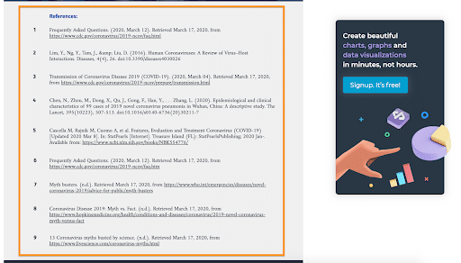
At the end of the infographic, a list of references enhances the credibility of the post and proves the origin of the data presented in it.
This is a nice and simple method to establish credibility across your blog posts and social media posts in a way that won’t be too long or too dull for your readers.
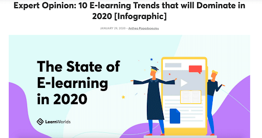
The second example I want to show you is from the online course creation software Learnworlds.
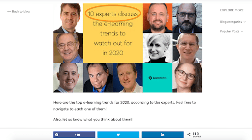
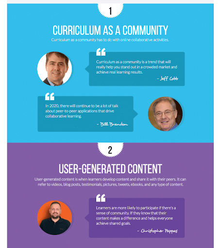
In this post about e-learning trends in 2020, Learnworlds provides its audiences with opinions from industry experts, which establishes social proof and credibility.
The infographic that they’ve created for this blog post that presents the quotes and opinions by the experts (as shown above) is done in a playful and compelling way that draws the reader’s attention.
It looks fun and makes you want to read the quotes, right? Notice the bright and light-hearted colors: They really pop out and catch the eye.
That’s what you want from your visual content.
Tip 4. Include Visual Flow Elements
The fourth tip I want to give you is to create and include visual flow elements. Such elements can really make a difference to audience engagement. So, you should try to incorporate them into your digital marketing strategy. Why?
The answer lies in the excerpt below:
In other words, visual flow elements create compelling visual links between points that you want to highlight. This way, the viewer knows where to look and feels engaged in the process of receiving and consuming your social media content.
Examples of how to make an infographic that includes flow elements
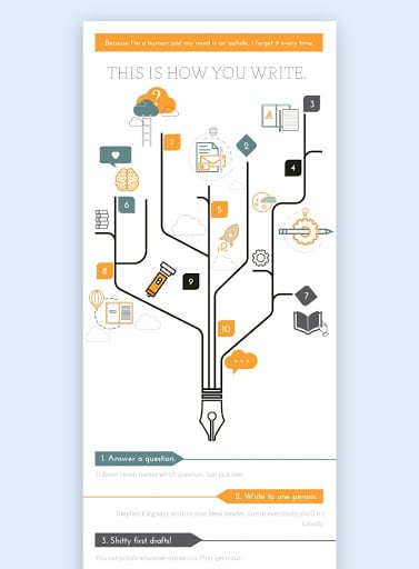
Here’s an example of what a beautiful visual flow element can look like:
Some other examples might look slightly different, but the point is that you create a direction for the viewer to read or pay attention to something that you want to stress.
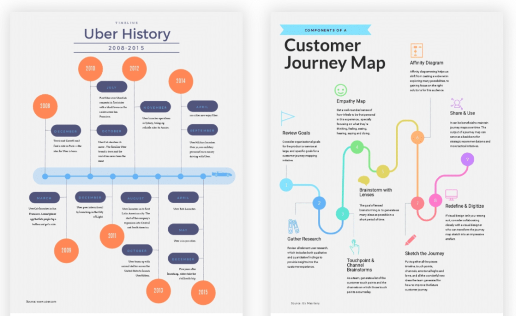
These Visme social media infographic templates show how a timeline or a flowchart physically directs users through your infographic. By using visual components like arrows, triangles, and lines you help your audience engage more and not be simply consuming flat content.
If you haven’t tried this method out yet, you should definitely consider adding some on your social media accounts and upgrade your content strategy by creating exciting visuals.
Let’s now move on to the second-to-last tip I have for you.
Tip 5. Test Your Font for Readability Before You Publish
I can’t stress this tip enough.
You’ve done great work creating your infographics in the process of upgrading your social media marketing strategies and increasing the engagement on your social networks. Now, it’s time to make sure that everything you’ve created and written is displayed properly.
To do so, you should consider using a social media posting preview tool. (For example, you can use this one for LinkedIn posts or this card validator for your tweets.) Those tools can be very helpful since they’ll take away any doubt about how your posts will look when published. Plus, it’ll give you the opportunity to fix any mistakes or improve your posts’ readability.
By checking your social media share previews, you can make sure that your posts, your website, and any kind of content that you wish to publish is ready to be shared on social media platforms.
What’s very important is that you preview your social media posts with reference to the way that they appear on different devices, such as on mobile devices, so all kinds of users can read it and engage with your content.
Put another way, your social media strategy should always take into consideration how your content is shown across all devices and that your posts appear as they should.
What you might also find helpful in terms of social media management is to use social media scheduling tools. Such tools will help you with publishing, analytics, team collaboration, and other processes that can make your overall social media marketing efforts easier and more effective.
Examples of how to make an infographic with great font readability
Before we move on to the last tip I’ll be sharing with you in this post, I’d also like you to keep in mind how engaging well-made visuals that display properly can be.
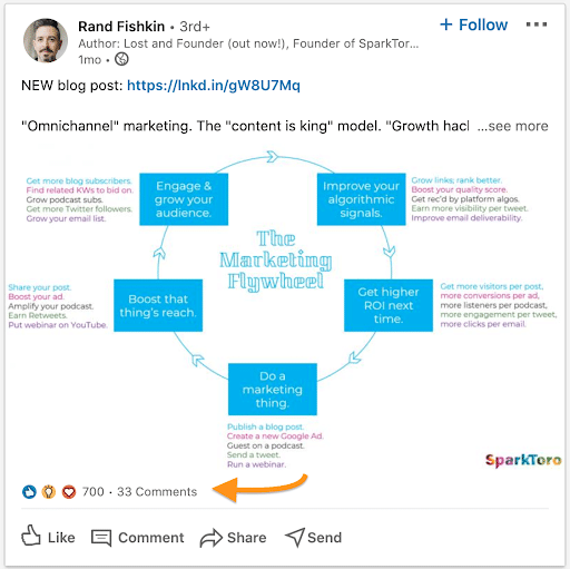
Rand Fishkin shared a circular flow diagram, the so-called “Marketing Flywheel,” on his Linkedin account. The post looks nice and it’s definitely engaging. Arrows and brightly colored text catch the eye.
I’ve highlighted the number of likes and comments above with an orange arrow.
We see that audience engagement is high. Rand is getting such high numbers of engagement because he’s an SEO legend, alongside the fact that he’s always posting eye-catching, engaging, and valuable content.
However, smaller businesses will also find it beneficial for their audience engagement to publish postings that are displayed properly and contain great content.
Simply put, it’s always a combination of processes and features that can make your posts stand out and invite your audience to engage with your content and be active.
Tip 6. Create a Catchy Headline
The last tip I think you’ll find useful and effective is to create catchy headlines.
Why is it important? Headlines are the very first thing that someone sees and reads in your posts. If the headline is dull and presents no interest, it’s very likely that fewer people will be willing to engage with it, give it a thumbs up, or comment on it.
No one wants to put effort into content that’ll go unnoticed, right?
I believe that an example will make my point more clear and give you an idea of what a catchy headline might look like.
Examples of how to make an infographic that has a catchy headline
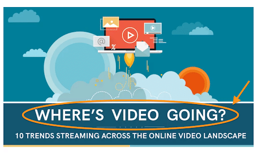
The OTT platform Uscreen is using the power of catchy headlines successfully in the post that I’m showing you below.
In a post about video content and its future, the headline couldn’t be more simple and straightforward. The headline is short but gives the reader a very clear idea of what this post is about.
What makes it even better?
The fact that the headline is not plain text … but instead, it’s placed on an image that catches the eye and invites the user to keep reading the post.
The same applies to any kind of social media posts. Simply put, keep your headlines nice and short!
(Note: As the subheadline of your post can be slightly longer, you can use that to give more information on the topic of your post if it’s necessary.)
Another example of creating a catchy headline is the following from digital customer loyalty program Referralcandy:
More than just eye-catching and engaging, the headline, background, and visual elements, are fun. The graphic makes you want to consume the content provided and engage with it.
The headline itself makes a bold statement and sparks users’ curiosity and willingness to go through the post and discover what it’s about. You should be going these kinds of headlines, so you can attract users and convince them from the beginning that your content will be interesting.
In Conclusion
In this post, we’ve talked about how you can get higher engagement by sharing infographics on your social media accounts. I’ve shared with you some tips in relation to your topic and the importance of your infographics being relevant to the services that your company is offering.
In addition to that, always remember to keep the balance between your text and images. Make sure that neither of the two overpowers the other.
* * *
Sign up now for a FREE demo.
